

01 · Overview
Data Visualization at Mission Scale
During my summer internship at Blue Origin, I was embedded in the BDMS (Blue Data Management System) team as a UX Design Intern. BDMS is Blue Origin's in-house platform for storing, managing, and visualizing test data across multiple campaigns and missions, used by over 1,500 engineers and analysts company-wide.
My work focused on enhancing the platform's plotting capabilities through user research, ideation, and interaction design, ultimately delivering new features that help engineers analyze mission-critical data faster and without switching to external tools.
1,500+
Engineers and analysts using BDMS across Blue Origin
9
User sessions conducted across engineering roles
2
Core features designed: Element Math and Stacked Plots
02 · Context
Why BDMS Matters
What is BDMS?
Blue Data Management System is Blue Origin's in-house platform for storing, managing, and visualizing test data. Its core capability is quickly retrieving large data sets (sensor readings, session logs) and making them available for immediate analysis, rather than depending on external databases or slower manual processes.
BDMS is a critical tool for test and flight operations across all Blue Origin business units. In 2025, it directly supported key company priorities tied to some of the most ambitious programs in the industry.
New Glenn
Supporting launches and booster landing analysis for Blue Origin's orbital-class launch vehicle
Lunar Lander
Enabling data-driven decisions for the Blue Moon lunar lander program
New Shepard
Supporting suborbital flight analysis and engine production delivery timelines
03 · The Challenge
A Tool That Slows the Work Down
Despite being central to engineering operations, BDMS had significant gaps in its plotting capabilities. Engineers were spending time working around the tool rather than with it, constantly pulling data out to other software just to do basic analysis.
BDMS Before
Before these features were designed, the BDMS interface was limited to a single-plot view with no in-line calculation or multi-channel comparison support. Scroll through to explore the existing experience.
BDMS before redesign, single-plot view with limited manipulation capabilities
Workflow Inefficiencies
Users constantly switch between BDMS, WinPlot, MATLAB, and Python. No ability to perform quick calculations within the BDMS interface itself
Visualization Limits
No way to compare multiple data streams simultaneously. Missing advanced features like multi-Y axis support and customizable annotations
Analysis Gaps
Limited built-in math functions for data manipulation. No integrated tools for complex operations like PID calculations or data reduction
How Might We
How might we keep engineers in BDMS for the full analysis workflow, reducing reliance on external tools while still supporting the depth of analysis they need?
04 · Research
Getting Closer to the Work
User Sessions
I conducted 9 user sessions with engineers across Blue Origin, including sessions from a face-to-face BDMS feedback event and individual interviews with test engineers. Three distinct user types emerged, each with different relationships to test data.
Responsible Engineer of Tests
Test Owners
- Owns the component from arrival at test site to return
- Creates and manages test plans, reviews data for irregularities
- Needs: multi-plot views, faster data access, integrated tooling
Test Data Manager
Data Custodians
- Retrieves, categorizes, and uploads test data to BDMS
- Ensures data integrity and correct tagging
- Needs: automated transfers, structured workflows, clear success criteria
Test Data Analyst
Data Reviewers
- Reviews launch and test data, identifies anomalies and nonconformances
- Compares against historical data, reports results to leadership
- Needs: scripting support, integrated computation, automated analysis
"We're not experts in design like the component owners. We're the jacks of all trades. We know every component on the engine."
- Responsible Engineer of Tests
This came up repeatedly across sessions and was the clearest signal behind the Tool Fragmentation finding. Because Responsible Engineers of Tests span so many components, they're constantly jumping between systems and contexts: BDMS, WinPlot, MATLAB, exported spreadsheets, just to complete a single analysis. The breadth of their knowledge was exactly what made the tool-switching cost so high. Reducing that friction was the core design goal.
Heuristic Evaluation
BDMS was assessed against 10 usability principles. Three major violations were identified:
Flexibility & Efficiency of Use
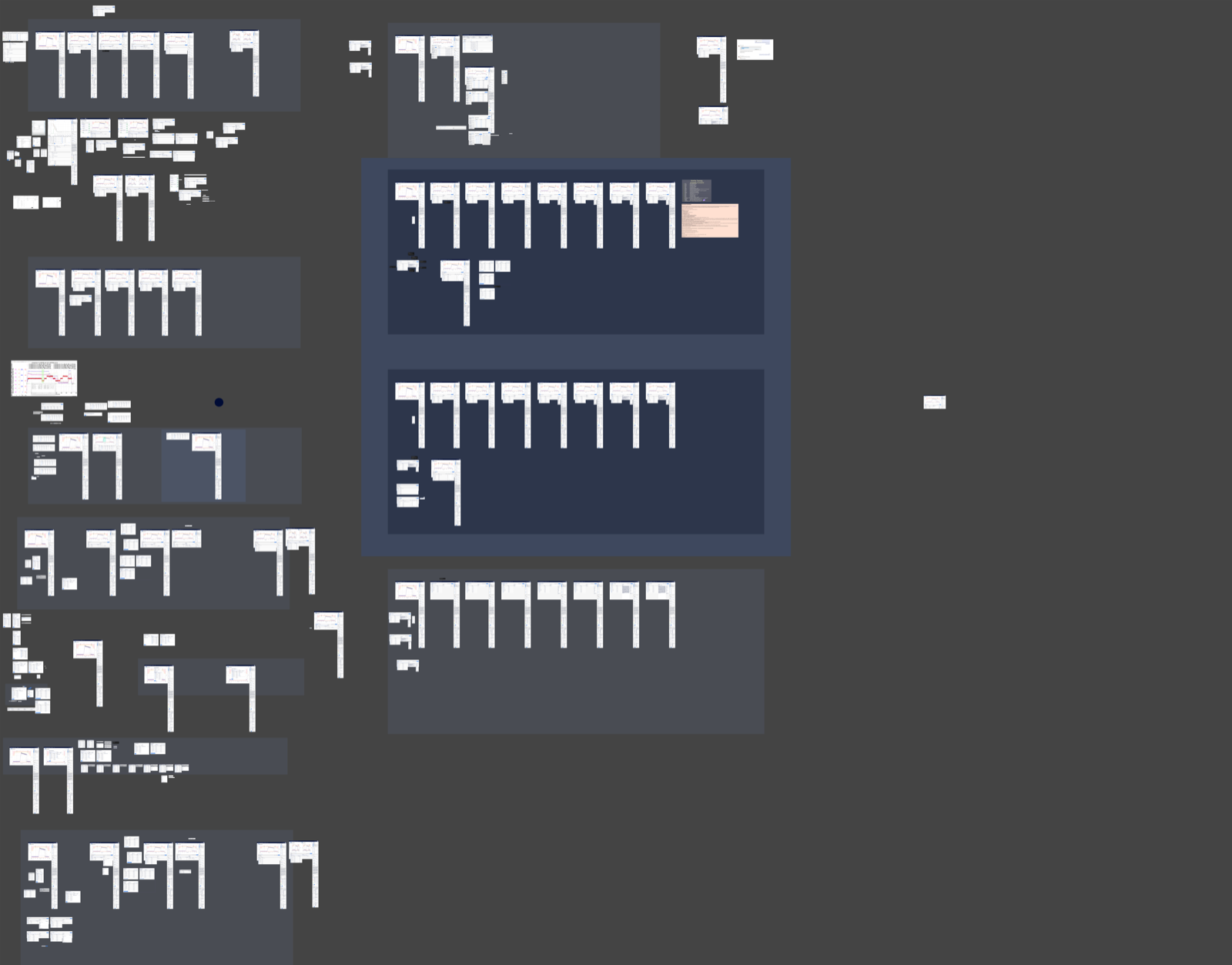
Users couldn't tailor frequent actions for speed or build personal workflows; every analysis required the same manual steps regardless of skill level. Addressed by designing element math as a persistent sidebar, keeping calculation tools always reachable within the plot context without interrupting the view.
Severity 4 / 5
User Control & Freedom
Limited undo support and restricted in-place editing left engineers locked into actions they couldn't easily reverse. Addressed through explicit Cancel and Back flows throughout the element math and stacked plots interactions, so engineers could modify or remove any expression or layout configuration at any point.
Severity 3 / 5
Visibility of System Status
During data retrieval, engineers had no indication of what the system was doing or how long it would take, creating uncertainty in high-stakes analysis moments. Addressed through progressive loading states on plots and active/inactive indicators in the element math sidebar that reflected calculation status in real time.
Severity 3 / 5
Key Findings
Tool Fragmentation
Engineers constantly switch between BDMS and external tools like WinPlot, MATLAB, and Python to complete a single analysis task. Every context switch adds friction and slows down the path from data to insight.
Flexible Plotting
Engineers want configurable plot types and layout options they can tailor to the specific data they are analyzing. A one-size-fits-all view forces manual workarounds that slow analysis.
Integrated Calculations
Strong demand exists for built-in math and computation tools that would reduce reliance on MATLAB and Python scripts. Exporting data to calculate and re-importing breaks the analysis flow.
Search & Filtering
Locating specific test sessions or data elements is difficult without robust search and filter capabilities. Engineers waste time scrolling through large datasets instead of analyzing them.
Annotations & Markers
Engineers lack tools to add event markers and annotations directly on plots, making it hard to communicate findings with their team or document observations in context.
Journey map: data collection through analysis and reporting
05 · The Opportunity
Two Features Worth Building
Based on research findings, two features were prioritized for their impact across user roles and their potential to meaningfully reduce context switching.
Element Math
Custom expressions within BDMS
- Addresses user need for data manipulation without leaving BDMS
- Enables creation of custom expressions and calculations on plotted data
- Supports comparison of PIDs, valve timings, and correlations
- Aligns with requests for more flexible, integrated analysis tools
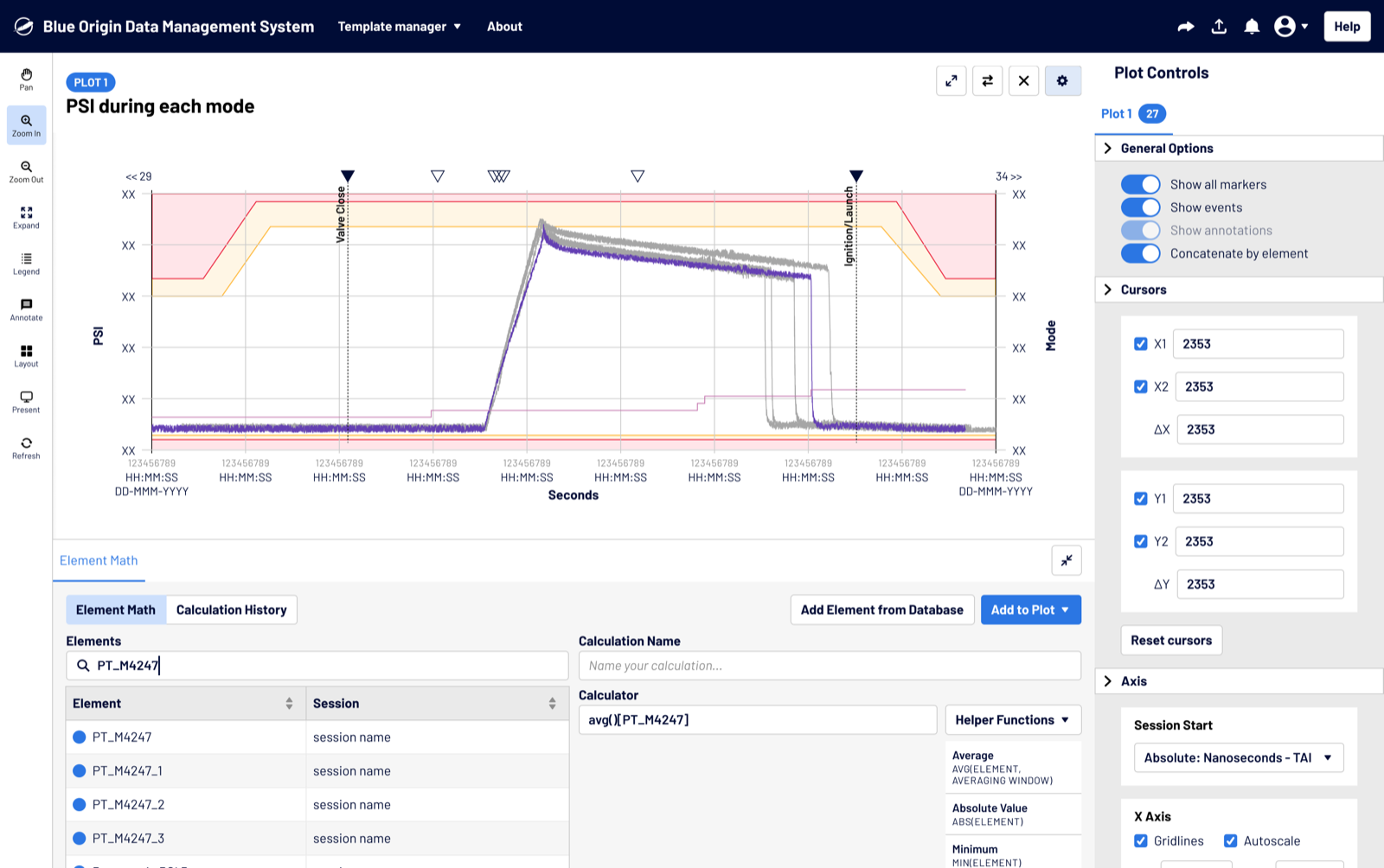
Stacked / Tiled Plots
Simultaneous multi-plot views
- Lets users view and compare multiple plots at the same time
- Supports comparison across different sensors and time periods
- Serves diverse analysis needs across all three user roles
- Improves efficiency in identifying trends and anomalies
Search & filtering and annotations were both surfaced in research, but they addressed a different layer of the workflow: data navigation and team communication rather than in-context analysis. Scoping to Element Math and Stacked Plots first let us focus on where engineers were losing the most time without spreading effort across the full product surface.
Business Case
Keeping engineers in BDMS for more of their workflow increases the ratio of insights gained to data collected and directly supports faster iteration in component development cycles
Technical Feasibility
Element Math required a dedicated calculation service; Stacked Plots had lower technical barriers but more UX complexity due to multiplied configurable plot states
06 · Ideation
Exploring the Design Space
Ideation involved brainstorming sessions with the UX team and key stakeholders, exploring innovative plotting techniques while keeping scope grounded in user needs and technical feasibility.
Simplify Complexity
How might we reduce the effort of data manipulation? Efficiency means minimizing context switching and reducing clicks
Enhance Visualization
How can we serve diverse analysis needs? Flexibility means allowing a more customizable, configurable experience
Balance Depth and Ease
How do we surface power without overwhelming? Modular design allows easy addition or removal of features without affecting the whole system
Inspiration: Element Math
WinPlot's modal interface gave a familiar reference point for mathematical operations. Video editing software showed how multi-panel layouts can support simultaneous workstreams. Day trading analysis tools demonstrated flexible, panel-based interfaces that keep context visible while performing calculations.
Inspiration: Stacked Plots
IGS, an internal system at Blue Origin, showed how configurable layout systems work in practice. ProRealTime and TradingView provided strong references for grid-based, multi-chart interfaces. Video and music editing software offered patterns for managing and navigating multiple panels efficiently.
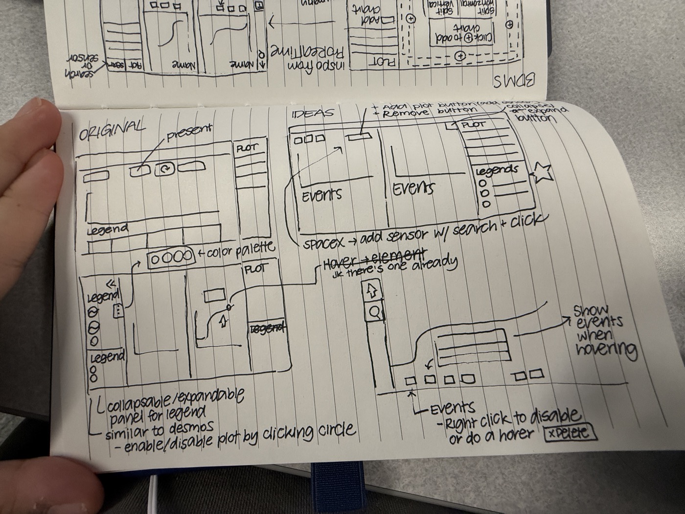
Move around the canvas to view where I got inspiration and what I sketched out.
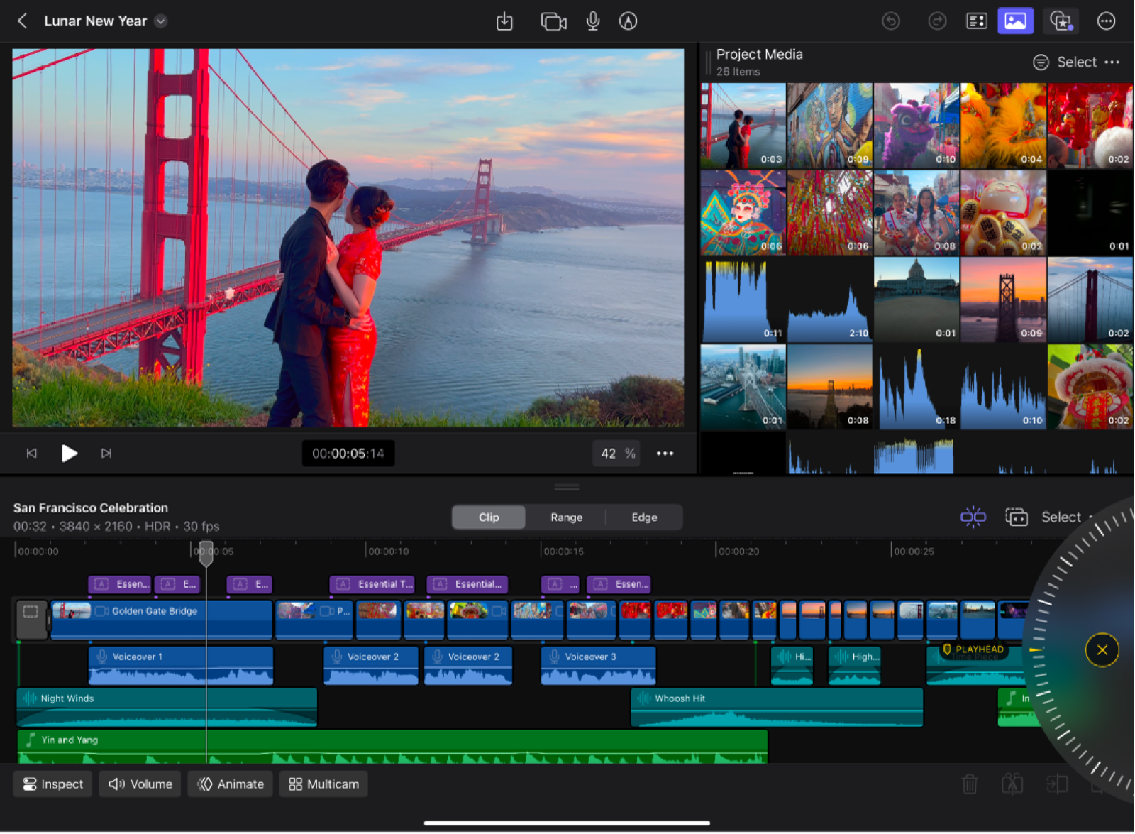
 TradingView
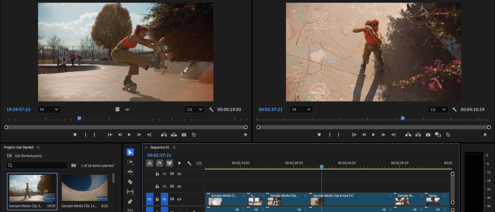 Adobe Premiere Pro
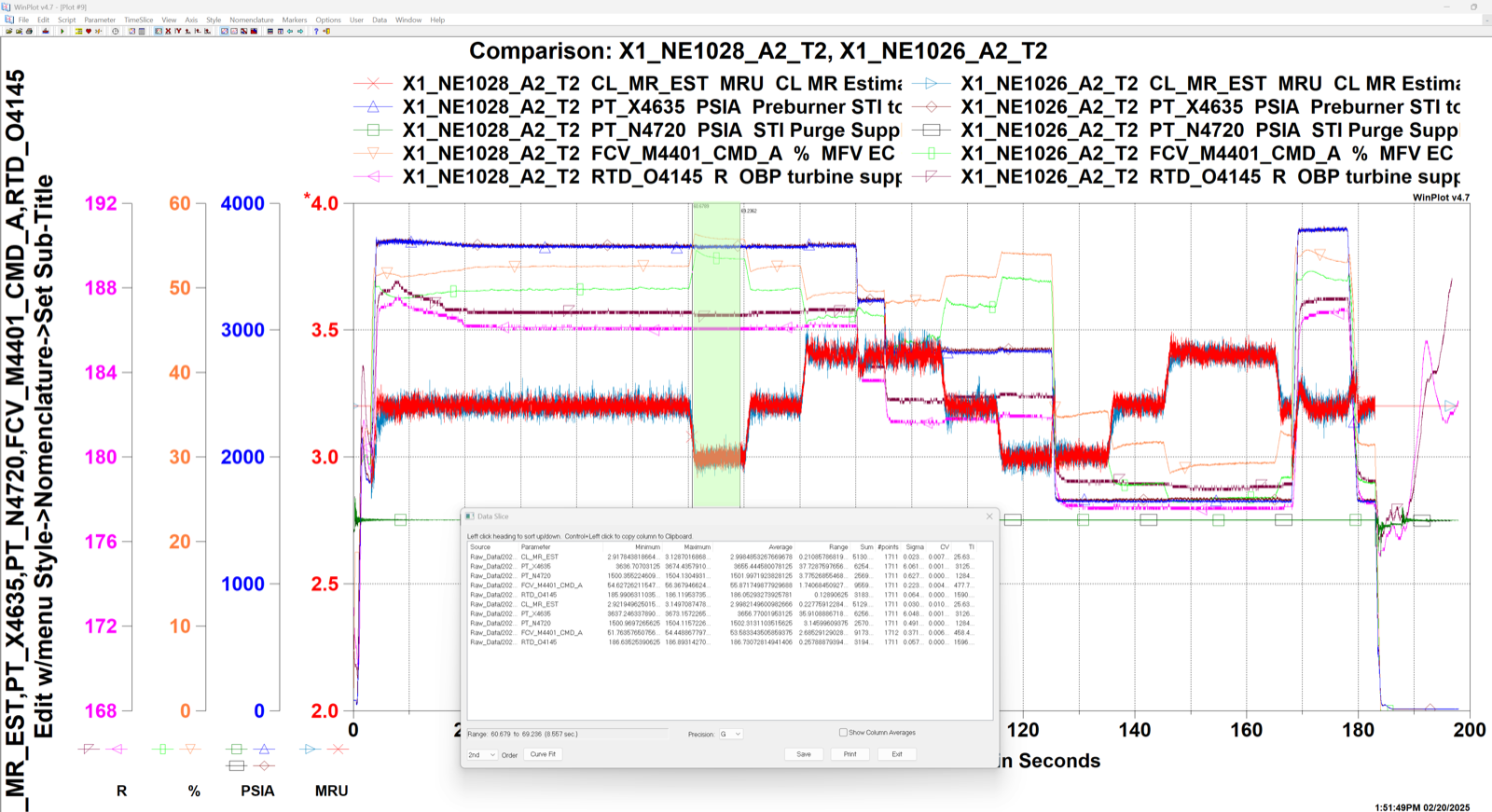 WinPlot
 Final Cut Pro
Ideation: process sketches and reference tools: TradingView, WinPlot, Final Cut Pro, Adobe Premiere Pro
The most useful references didn't come from other data tools. They came from spaces where people already manage complexity across multiple panels at once. Trading platforms like TradingView showed how to surface dense, configurable data without overwhelming the user. Video editing software like Final Cut Pro and Adobe Premiere Pro demonstrated how collapsible panels and timeline-based layouts keep context visible while you work. WinPlot was the closest thing to a direct analog, but it also showed exactly where the existing mental model broke down. Looking outside the obvious helped me see what BDMS actually needed to feel like: not a scientific tool with a redesigned UI, but something closer to a professional workstation.
07 · Design
Evaluating the Designs
Four options were developed for Element Math and three for Stacked Plots. Each was evaluated against user needs, technical constraints, and stakeholder feedback before a recommended direction was selected.
Element Math
WinPlot's modal was the baseline, but user research surfaced two blockers: complex expressions were hard to parse, and hiding the plot during calculation disrupted the engineering workflow. Four options were explored to find an interaction model that kept the data in view throughout.
Modal, Brackets
A modal opens from the ∑ sidebar icon. Engineers select elements and the expression builds in bracket notation inline. Familiar to WinPlot users, but the modal blocks the plot during expression building.
Why considered
- Familiar modal pattern reduces onboarding friction for WinPlot users
- Bracket syntax aligns directly with WinPlot conventions
Why not selected
- Modal blocks the plot; users wanted to see calculations side by side with the visualization as they build expressions
Modal, Tags
An expanded modal shows selected elements as visual tags, making large compound expressions easier to read and edit. Same entry point as Option 1 but with improved visual density and expression clarity.
Why considered
- Tags improve readability of complex, multi-element expressions
- Easier to remove specific elements without re-entering the whole expression
Bottom Panel, Tags
Inspired by video editing and day-trading tools, a collapsible panel at the bottom keeps the plot visible while engineers build expressions. Element search and calculation history stay accessible throughout the session.
Why considered
- Plot stays visible during expression building
- Panel collapses when not needed, preserving screen space
- Supports complex multi-step calculation workflows
Bottom Panel, No Tags
Same expandable panel structure as Option 3, but elements are shown in brackets, consistent with WinPlot conventions. Chosen for its non-disruptive access model and familiarity to engineers transitioning from WinPlot.
Why this was chosen
- Non-disruptive panel keeps engineer focus on the plot
- Bracket syntax directly aligns with WinPlot conventions
- Clearest transition path from WinPlot to BDMS workflows
Element Math: final design delivered to engineering
All four options were walked through with engineers in in-person sessions where they raised concerns and described how they'd use each one in a real test. The modal-based options were ruled out immediately for blocking the plot view, and bracket notation was strongly preferred over tags, matching the shorthand engineers already carried from WinPlot.
Stacked / Tiled Plots
Engineers frequently needed to compare data across sensors and launches side by side, but the existing one-plot-per-screen model made that workflow slow and disjointed. Three layout options were explored to support multi-plot analysis without overloading the interface.
Tiled Bars, Layout Buttons
Inspired by ProRealTime, this approach places + buttons around each plot. Clicking one reveals a directional tile picker, letting engineers choose exactly where the new plot is placed relative to the current one.
Why considered
- Directional icons communicate spatial placement at a glance
- Direct manipulation: no modal step, just click and place
Grid Templates, Layout Buttons
A left-nav layout panel, consistent with IGS, lets engineers pick from predefined grid templates. All plot arrangement options surface in a single panel, giving full control over layout before adding data.
Why considered
- Template-first approach reduces per-plot decision fatigue
- Consistent with IGS left-nav interaction patterns
- Multiple layout options visible simultaneously in one panel
Grid Templates, Right Click
Keeps the plot view clean by hiding controls until needed. Right-clicking a plot reveals a context menu for all management actions. The grid template picker follows inline, eliminating persistent button clutter entirely.
Why this was chosen
- Clean interface: no visible buttons competing with data
- Right-click is intuitive for engineers used to desktop tools
- Directly addressed feedback for seamless plot flexibility
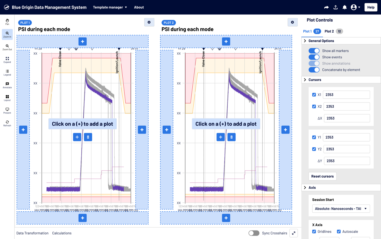
Stacked / Tiled Plots: final design delivered to engineering
Fixed-split and grid options felt too rigid; engineers needed to configure layouts based on what a specific test required, not adapt their workflow to a preset. Option 3's context-menu model gave them that control without adding setup overhead.
08 · Vision
Where This Goes Next
The work completed during this internship addressed the most pressing pain points, but the long-term goal is a comprehensive analysis platform that keeps engineers in BDMS for the full journey from data collection through insight. The features built this summer are the foundation, not the finish line.
Long-Term Vision
Comprehensive Analysis Platform
Build BDMS into a self-sufficient environment where engineers can collect, calculate, visualize, and communicate findings without leaving the tool.
Higher Insight-to-Input Ratio
Increase the value engineers get out of every piece of data they bring in by reducing friction at every step of the analysis workflow.
Reduced Reliance on External Tools
Retain engineers within BDMS across more of their workflow, replacing WinPlot, MATLAB, and Python scripts with integrated, purpose-built features.
Design Direction
Shared Workspaces
Let engineers save, name, and share configured plot layouts with their teams, making collaborative analysis and repeatable workflows possible.
Multi-Y Axis Support
Enable plots with multiple Y axes so engineers can overlay data streams with different units and scales on a single view without distortion.
Scripting Capabilities
Surface a lightweight scripting layer directly in BDMS so engineers can write and run custom calculations without switching to MATLAB or Python.
09 · Reflection
What I Took Away
The thing that surprised me most was how attached I was to conventions I'd absorbed without realizing it. I'd been designing with the people around me in mind: people who label things the way I label things, who think about interfaces the way design communities tend to think about them. When I brought tag-based element selection into the sessions, it made complete sense to me. Tags are readable, they're editable, they feel modern. Engineers looked at them and immediately wanted brackets.
That wasn't a preference; it was a workflow. Every time an engineer goes into a test, they already know what they're looking for: specific channels, specific calculations, specific relationships. That knowledge is encoded in their shorthand, and that shorthand uses brackets. Designing around labels would have meant asking them to re-learn something they'd never consciously learned in the first place.
That experience changed how I approach research. It's not enough to ask what people need. You have to find out what they already do, especially the things they take for granted. The edge cases that came out of those sessions weren't edge cases to the engineers. They were just Tuesday. Big shoutout to my mentor Wilo Dietrich and manager Shaan Gautam, and the whole BDMS team for bringing me into the work.
Design for Ingrained Processes
Engineers had years of muscle memory built around specific conventions: bracket notation, channel shorthand, test-entry checklists. Good design met them there instead of asking them to adapt to something new
Edge Cases Aren't Edge Cases
What looked like an unusual scenario to me was a routine part of an engineer's workflow. The sessions were most valuable when I stopped looking for the common path and started asking what they always had to watch for
Cross-Domain Inspiration
The best references for aerospace data tooling came from trading platforms and video editors, not because the domains are similar, but because the underlying need to manage multiple streams of information at once is the same