

01 · Overview
One Portal for the Locum Tenens Journey
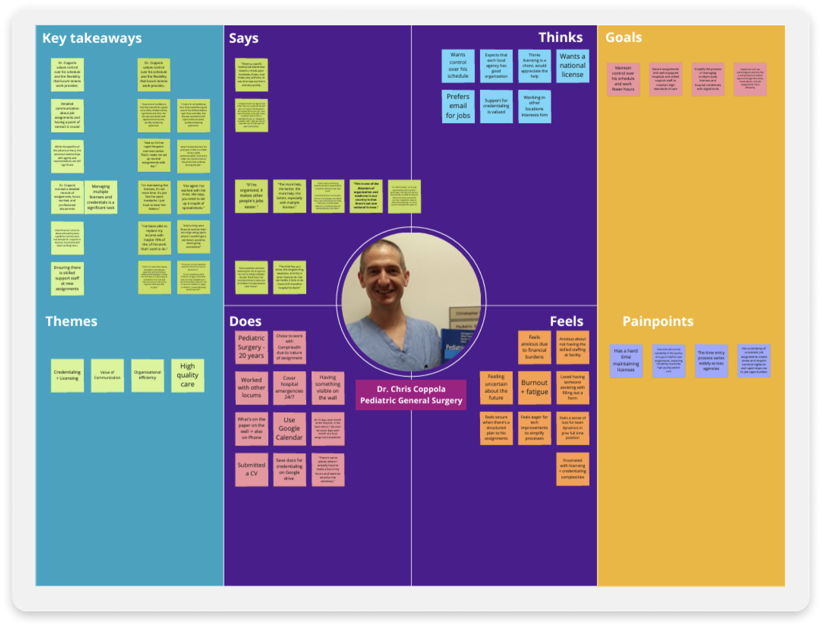
CHG Healthcare is the largest locum tenens staffing company in the United States, connecting physicians with temporary clinical placements across the country. During my internship, I worked on the Global Medical Staffing (GMS) Portal, a centralized platform providing access to Global Medical providers with a unified experience for managing their entire locum tenens journey.
My primary focus was the provider application redesign, a lengthy, multi-section credentialing form that physicians complete before going on assignment. The redesign introduced responsiveness, autosaving, and improved error handling to reduce friction and drop-off throughout the process. By the end of my internship, the designs were finalized and handed off to the portal design team, then passed to engineering for development over the following business quarters.
GMS Portal, centralized provider experience for locum tenens
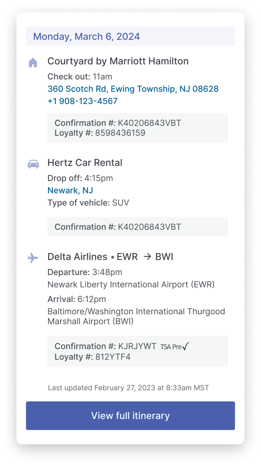
Travel management: providers can view flights, hotels, and rentals tied to each assignment in one place
02 · Context
A Day in the Life: Managing Locums Jobs Shouldn't Be This Hard
Locum tenens physicians are constantly on the move, taking temporary assignments at hospitals and clinics across the country. Before they can begin any assignment, they go through an extensive credentialing process: filling out personal information, education history, licenses, work history, insurance, and more. The old application was a single, continuous scroll spanning 30 to 40 pages of information with no way to save progress or navigate between sections. Providers were abandoning mid-form and losing everything.
Global Medical providers also had no unified home. They were navigating multiple disconnected systems just to manage a single assignment, creating unnecessary cognitive load on top of an already demanding profession.
The fragmented provider experience before GMS
Design Challenge
How might we create a centralized, intuitive experience that helps Global Medical providers manage their locum tenens journey, from application to assignment, without friction?
03 · Discovery
Where Providers Were Getting Stuck
We needed to understand where the most significant bottlenecks were occurring. Usage data across the portals painted a clear picture of where providers were struggling and where placements were stalling.
1.41%
Interest conversion rate over six months, indicating a need to encourage more providers to act on job opportunities
37.0%
Of visits across all portals were to the time entry section, the most visited area, centered around assignment management
24.0%
Of visits came from providers not yet on assignment, highlighting the urgency of getting providers placed faster
The Major Points
These challenges created significant friction for providers, which hugely impacted their efficiency and overall satisfaction.
Lacking Representation
Fragmented ecosystem
Global Medical lacked a centralized tool, forcing providers to navigate multiple disjointed systems just to manage a single locum tenens engagement.
A Never-Ending To-Do List
Repetitive credentialing
The credentialing process was like being stuck in a loop. Providers had to fill out the same information over and over, with no way to save progress or pick up where they left off.
These two problems shaped every decision in the redesign: build a unified home for Global Medical providers, and make the credentialing process something providers could actually complete.
04 · Process
Reaching Business Goals Together
With the problem space defined, the work shifted to alignment and discovery. I collaborated closely with business analysts and product managers to align with business goals, specifically increasing the number of providers placed on assignments.
Collaboration
Working cross-functionally, I joined alignment sessions with BAs and PMs to map business goals to design decisions. The core objective was clear: get more providers credentialed and placed on assignments faster. Those sessions were where scope decisions got made: what was in for this quarter, what got pushed, and what tradeoffs engineering could realistically support. Having a seat at that table early meant the designs I brought into review were already grounded in what was buildable, not just what was ideal.
Empathy Mapping Sessions
To understand the frustrations providers face firsthand, I conducted empathy mapping exercises and user interviews. These sessions surfaced recurring themes: confusion around required fields, anxiety about losing progress mid-form, and frustration with generic error messages that offered no actionable guidance.
Empathy mapping: surfacing the emotional landscape of the provider application experience
"It's like filling out the same form over and over, and if you close the tab, you lose everything and have to start again."
Provider feedback · User interview
Design Reviews and Heuristic Evaluation
Since we couldn't run usability testing directly with providers during the internship, I validated designs through structured design reviews and a heuristics evaluation session I hosted with my design manager, a few other designers, and my PM. Walking through the interface against established heuristics alongside people with different lenses (product, engineering, brand) surfaced gaps and assumptions I wouldn't have caught on my own. It also gave stakeholders early visibility into decisions before anything was finalized.
05 · Design System
Defining the Visual Identity for GMS
Before any screens were designed, GMS needed its own visual identity. I audited the existing style libraries across CHG's portals (CompHealth and Weatherby) to understand the product family, then worked with my design manager and brand marketing to define a style that was distinctly GMS while staying consistent with CHG's broader ecosystem.
Every color decision went through an accessibility review. I validated color contrast ratios against WCAG standards with my design manager and brand marketing before anything was finalized. For typography, I evaluated several options including Figtree, Satoshi, and Inter, and presented them alongside CHG's original brand font. The original was more rigid and constrained for a form-heavy interface. After alignment sessions with design leadership and brand, we landed on Inter for its legibility, flexible weight range, and clean fit with medical credentialing forms.
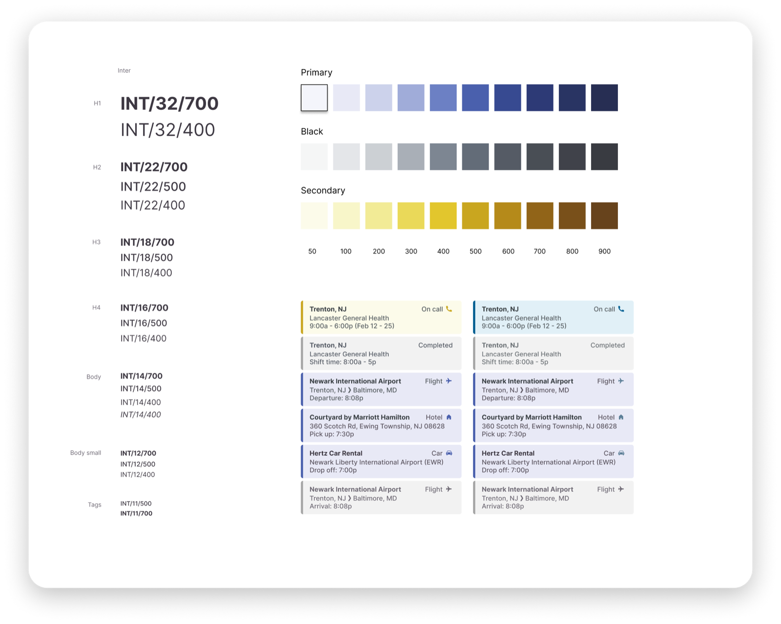
GMS design library, including tokens, type scale, and component foundations
Color System
Primary and secondary palettes with full shade scales (50–900) to support hierarchy, states, and accessibility across the application.
Typography
Inter across all weights and sizes, from H1 display down to helper text, with a structured naming convention (INT/size/weight) for developer handoff. Chosen over Figtree, Satoshi, and the original brand font for its legibility at small sizes in form-dense interfaces.
Component Tokens
Reusable field, label, helper text, and error state components built around GMS's established style, ensuring consistency across every section of the application form.
06 · Key Features
Four Changes That Made the Biggest Difference
The work touched four areas, each directly tied to friction points uncovered in research. Together, they reduced the cognitive load of credentialing and made the path to placement meaningfully shorter.
Provider Application
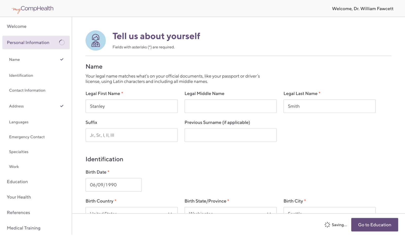
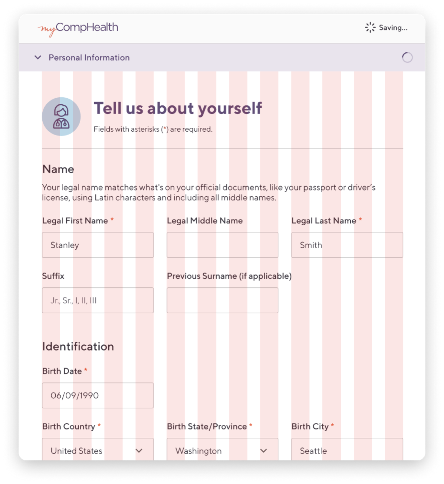
The provider application was the highest-priority project because it was a direct business need: getting providers credentialed and placed on assignments faster translates directly to placements and revenue. Research pointed clearly at the interface as a major friction point. The old form was a single, unbroken scroll across 30 to 40 pages of credentialing fields. No progress indicator, no section navigation, no save. Providers were losing hours of work to a closed tab.
The redesigned application breaks that same information into a structured, step-by-step form with clear section indicators, required field markers, and contextual helper text guiding providers through each step without ambiguity.
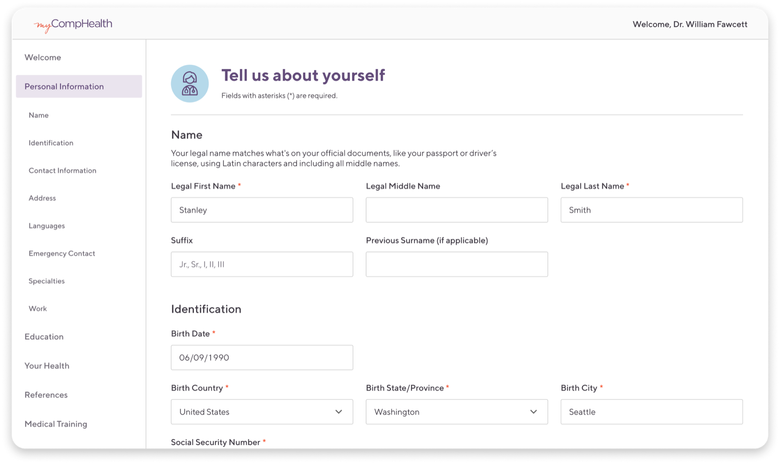
Desktop: full multi-section form with sidebar navigation
Mobile: responsive layout optimized for on-the-go completion
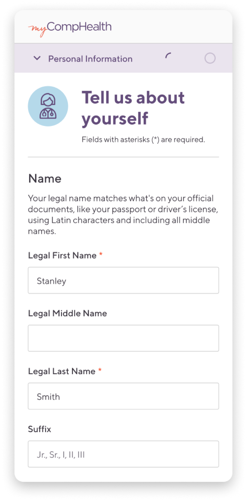
Responsiveness
Providers complete credentialing from wherever they are, often on a phone between assignments. Usage data showed roughly 20 to 25% of medical providers were already attempting to fill out the application on mobile, making responsiveness a requirement, not a nice-to-have.
I worked closely with engineers to understand the technical constraints, then tested across breakpoints to determine how many input fields could comfortably fit at each screen width. For a form this dense, the number of fields visible without scrolling was a real UX decision, not just a layout one. The result was a layout that adapts gracefully from desktop to mobile without sacrificing form clarity.
Responsive layouts, designed and validated across breakpoints with engineering
Autosave
One of the most requested improvements from providers was the ability to save progress. I again worked closely with engineers to understand the technical constraints, then designed an autosave system that quietly persists form state as providers move through sections. The "Saving..." indicator eliminates anxiety about losing progress, and providers can return to the application across multiple sessions without starting over.
Sticky Bar + Save Button
A sticky bar ensures the Save action is always within reach without scrolling. Continuous saving feedback (similar to Google Docs) builds confidence that work won't be lost.
Why considered
- Save buttons on both top and bottom of the current portal felt redundant; the sticky bar consolidates
- Full timestamp transparency reassures providers their data is securely stored
- Having both "Save" and "Save & Continue" could be confusing
Auto-save, No Button
Since data is already persisted on the backend, a Save button is unnecessary and risks becoming a placebo. Auto-triggering on field interaction removes cognitive overhead while providing real-time feedback.
Why this was chosen
- Providers can focus entirely on entering information, not managing saves
- Removes the "Save" button acting as a placebo; users often don't know saves are already happening
- Explicit like Google Forms: full date and time shown on save confirmation
Auto-save + Hover Timestamp
Same as Option 2, but the sticky bar shows only "Saved" to minimize clutter. Hovering reveals the full timestamp for providers who want to verify exactly when their data was stored.
Why considered
- Keeps the sticky bar minimal and unobtrusive during active form-filling
- Full timestamp accessible on demand without always occupying space
- Hover pattern aligns with minimal, focused interface feel
Top Nav Status + Hover
Save status moves to the top navigation bar, eliminating the bottom sticky bar entirely and streamlining the interface. Users naturally check the nav for contextual state.
Why considered
- Reuses existing nav bar space: no new UI component needed
- Consistent position visible regardless of scroll depth
- Removes bottom sticky bar → cleaner, less cluttered form view
Top Nav Status, Always Visible
Save status in the nav bar with the full timestamp always displayed: maximum transparency about when data was last saved, no hover required. Works on touch devices too.
Why considered
- Maximum transparency: full timestamp permanently visible
- No hover required, friendly for mobile and touch use cases
- Same consistent position regardless of where providers are in the application
Personal Information
Interactive prototype · autoplay
We went with Option 2: autosave triggered silently on field interaction, with a full timestamp confirmation in the sticky bar. No Save button, no extra step, no anxiety about losing progress.
The timestamp ("Saved at 4/23/2024 at 3:21 PM MST") was a deliberate choice. It gives providers the same explicit reassurance they get from Google Forms: their data is stored, and they know exactly when.
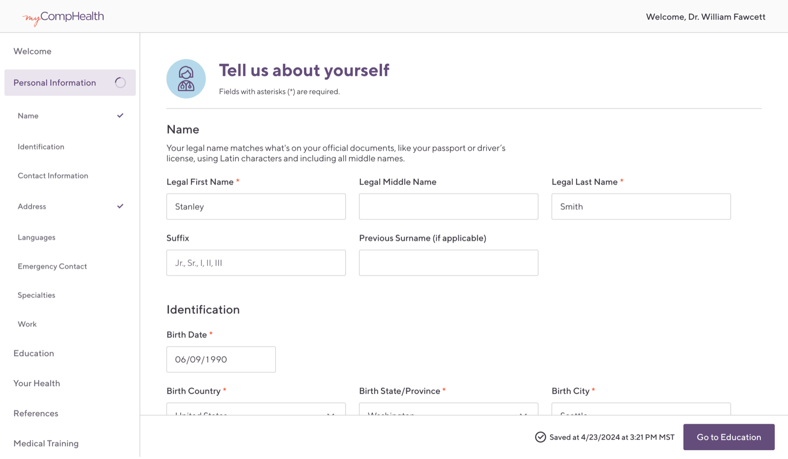
"Saved at [date] at [time]" appears in the sticky bar automatically after field interaction, no Save button required
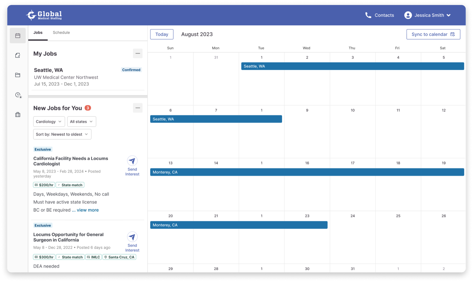
Time Entry
Providers managing multiple simultaneous assignments needed a clear, low-friction way to log time, but GMS routes time entry to third-party platforms, adding a layer of complexity. I explored four approaches before landing on one that balanced familiarity, context, and clarity.
Side Panel
Clicking "Enter Time" slides in a side panel to select an active assignment, mirroring the contact panel pattern already established in the portal and prototyped in the mobile app.
Why considered
- Consistent with the existing contact panel interaction: no new patterns to learn
- Keeps the main Time Entry page visible in the background
- Mirrors the mobile app panel experience providers were already familiar with
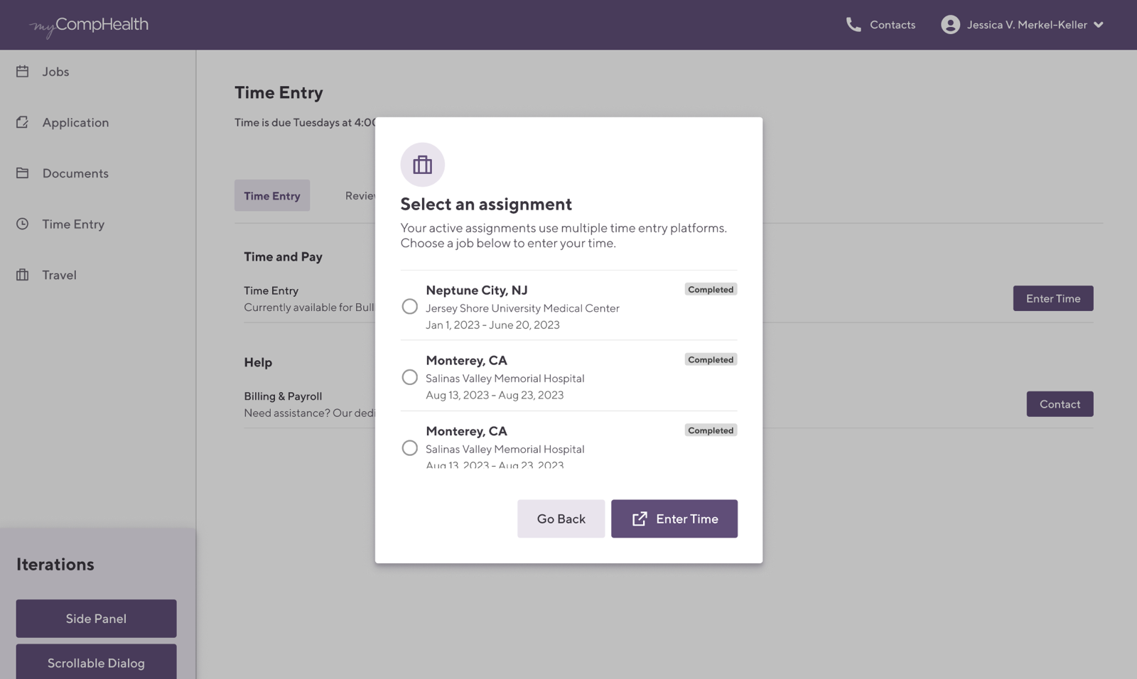
Scrollable Dialog
Same entry point as Option 1, but "Enter Time" opens a centered scrollable dialog. Keeps focus on the assignment list while handling providers with many concurrent assignments gracefully.
Why considered
- Centered overlay creates clear visual focus on the assignment selection task
- Scrollable for providers managing many simultaneous assignments
- "Enter Time" is disabled until an assignment is selected, preventing errors
Dedicated Tab + Dialog
A complete rethink: a unified page showing "My Jobs" alongside a calendar grid, giving providers schedule context when entering time. Assignment selection is handled via a dialog overlaid on the calendar.
Why considered
- Combines job management and time entry in one surface, with less navigation overhead
- Calendar grid shows providers exactly when their assignments fall
- Dialog approach is familiar from earlier iterations
Dedicated Tab + Slide-in Panel
Same unified calendar + My Jobs view as Option 3, but assignment selection uses a slide-in panel instead of a dialog. The panel offers more vertical scroll space and a clearly anchored "Enter Time" CTA, chosen for its clarity and alignment with portal-wide panel patterns.
Why this was chosen
- More scroll space than a dialog, essential for providers with many assignments
- Consistent with the portal's existing side panel and mobile sheet patterns
- "Enter Time" button anchored at bottom of panel: always visible, always reachable
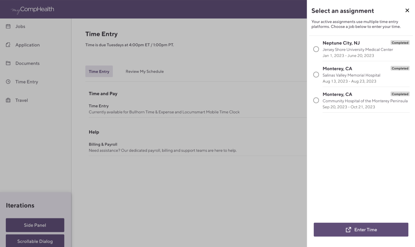
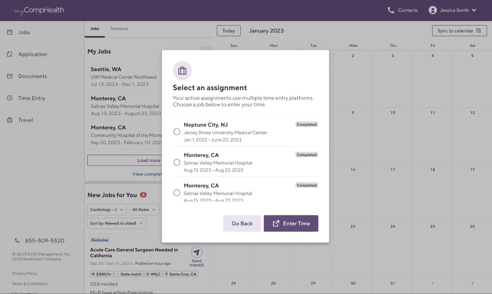
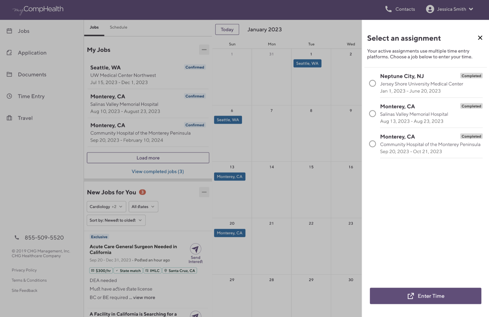
We went with Option 4: a dedicated Job Board view that surfaces assignments in context, with a slide-in panel for selection. The panel gave providers enough vertical space to scan all active assignments and kept the "Enter Time" CTA anchored at the bottom where it's always reachable.
The left nav (Jobs, Apps, Docs, Time Entry, Travel) reflected the portal's existing information architecture, making time entry feel like a natural part of the workflow rather than a standalone detour.
"Select an assignment" panel slides in from the right, with "Enter Time" anchored at the bottom
07 · Reflection
Designing for Alignment
This internship was as much about building relationships as it was about building interfaces. Working in a large enterprise environment meant that good design required strong cross-functional alignment with business analysts, product managers, and engineers before a single pixel moved.
The biggest lesson: rapport is a design tool. The more trust I built with stakeholders, the more latitude I had to advocate for the provider experience. Hosting the heuristics evaluation session was a turning point in that respect. Putting myself in the facilitator seat for a group of designers, my PM, and my design manager pushed me to articulate design decisions in terms of principles and user goals, not personal preference. The designs got sharper and the relationships got stronger at the same time.
That said, I'd do some things differently if I were starting over.
Strong Rapport Opens Doors
In a large organization, the quality of your relationships determines the quality of your outcomes. Investing in trust with cross-functional partners early made every design conversation more productive.
Speaking Everyone's Language
Working across BAs, PMs, and engineers taught me to translate between disciplines: user needs into business impact, technical constraints into design decisions, and back again. That fluency made alignment faster and handoff smoother.
Less Documentation, More Clarity
I over-documented early in the project. The thoroughness came from good intentions, but it ended up overwhelming stakeholders instead of clarifying things. I'd invest that time in tighter, more visual summaries that lead with the decision rather than the process behind it.
More Room to Experiment
I wish I'd pushed further on design patterns before converging. The iterations I explored were well-reasoned, but they stayed within familiar patterns. With more time, I would have pressure-tested a wider range of approaches before narrowing, especially for something as high-traffic as time entry.