

01 · Overview
Simplifying Skincare for Everyone
Born out of a collaboration at Creative Labs, a student-led design organization at UCLA, Clearify aims to solve a common dilemma in the online skincare market: the overwhelming task of understanding and comparing product ingredients.
As part of the Clearify team, I contributed to the design system, surveys, and wireframing, ensuring a seamless and intuitive user experience for the Chrome extension.
Team
Raina Wan & Tiana Ly (Project Leads) · Marie Godderis & Nivetha Balu (Project Managers) · Nitya Khanna, Meg Yuan, Stephanie Mae Mauricio (Designers) · Ashish Basetty, Lucian Li, William Wong (Engineers)
02 · The Problem
Lost in the Ingredient List
The skincare industry, with its rapid growth and vast product offerings, often leaves consumers feeling overwhelmed, particularly when shopping online. Users frequently struggle to understand complex ingredient lists and discern which products are suitable for their specific skin types and concerns — such as sensitivity, acne-proneness, or allergies to ingredients like sulfates or parabens.
This complexity is heightened for those new to skincare, who find navigating through the options confusing and time-consuming.
Problem Statement
How might we simplify the process of selecting skincare products that align with individual needs and preferences?
03 · Research
Understanding the Landscape
Competitive Analysis
We conducted an in-depth competitive analysis spanning API resources and existing skincare analysis products to identify opportunities for innovation and differentiation.
APIs Researched
Cosmily API
Offers detailed analysis of ingredient lists — helped us understand the depth of information users might expect from an analysis tool
CosDNA
Provides comprehensive data on skincare ingredients with an emphasis on safety concerns and potential irritants
SkinSort
Offers an easy-to-use widget for skincare analysis, showcasing how user-friendly design can lower the barrier to ingredient literacy
Product Inspiration
Skincarisma
Ingredient analyzer that is both informative and user-friendly — provided insights into how we might design Clearify's interface and results layout
EWG Skin Deep
Extensive database highly regarded for its focus on safety and health impacts — inspired our approach to ingredient transparency and scoring
INCIdecoder
Breaks down ingredient lists into plain terms — inspired us to make our tool accessible to users without a scientific background
Key Takeaways
Strengths
Competitors use icons and colors to simplify complex ingredient information, with clean, organized UI and skin type personalization
Gaps
Text-heavy layouts, unclear rating systems, and information overload — users need better segmentation and clarity
Opportunity
Optimize navigation for next product analysis, provide clearer ingredient score breakdowns, and increase transparency
Survey Insights
We surveyed 22 respondents — primarily university students — to understand their skincare shopping behaviors and preferences.
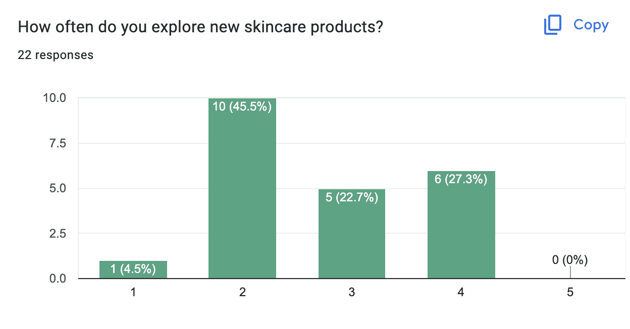
How often do you explore new skincare products?
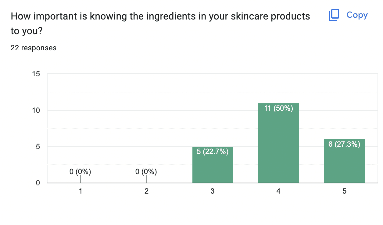
How important is knowing the ingredients in your skincare?
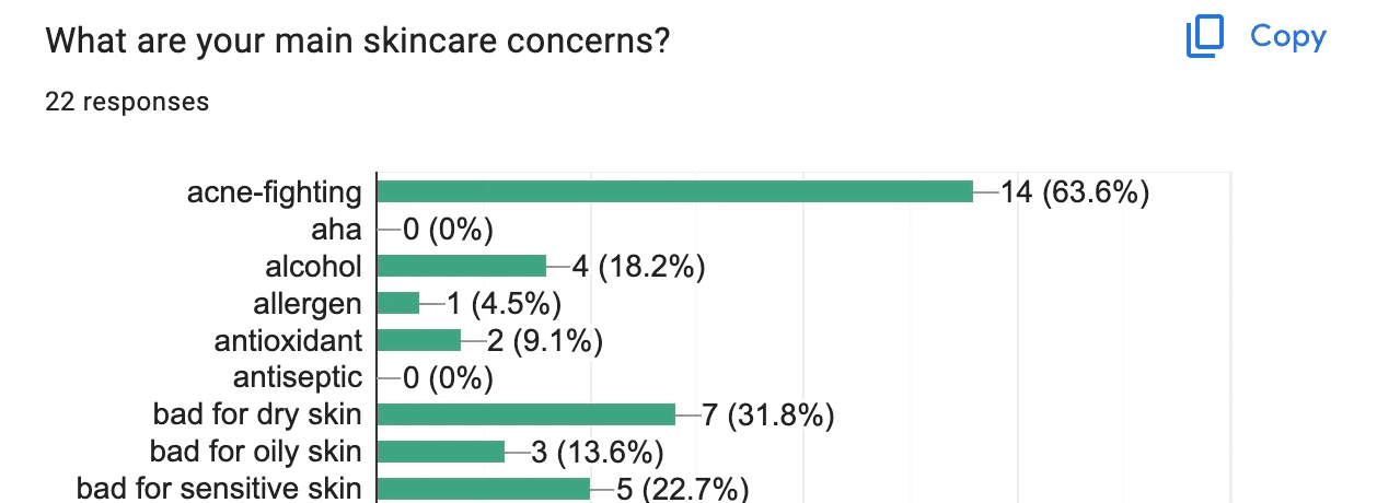
What are your main skincare concerns?
Survey findings across 22 respondents
50%
Rated knowing skincare ingredients as important (4/5)
72.7%
Cited moisturizing as a primary skincare concern
Most
Have never used an app or extension for skincare product research
"Users show a keen interest in understanding ingredients, indicating the need for an educational component."
— Survey Finding
04 · The Goal
Personalized, Accessible Skincare Analysis
Develop a browser extension that streamlines the skincare product selection process by providing immediate, personalized ingredient analysis and recommendations.
This Chrome extension was designed to demystify skincare shopping, making it personalized and accessible for every user. Clearify scans and analyzes product ingredients across various e-commerce platforms, turning a daunting task into an informative and user-friendly experience.
For New Users
Decode complex ingredient lists into plain language — no scientific background needed
For Power Shoppers
Surface ingredient flags and skin type compatibility instantly while browsing any store
05 · Ideation
Mapping the Experience
User Flow
We crafted a streamlined user flow to serve as the backbone of our Minimum Viable Product. This allowed us to deliver a functional product quickly, focusing on core features to meet primary user needs with the potential for iterative improvements based on feedback.

MVP user flow — from product page to ingredient analysis
Design Library — Harmonizing Aesthetics
Clearify's visual language was crafted to embody security and foster confidence within the digital skincare space. The design was guided by the goal of establishing a serene and dependable environment, where users could feel assured in their skincare choices.
The library features a modern aesthetic, employing a soothing green color palette and clean typography to convey reliability and ease. Strategic use of space enhances readability, while consistent UI elements promote a seamless, intuitive experience.
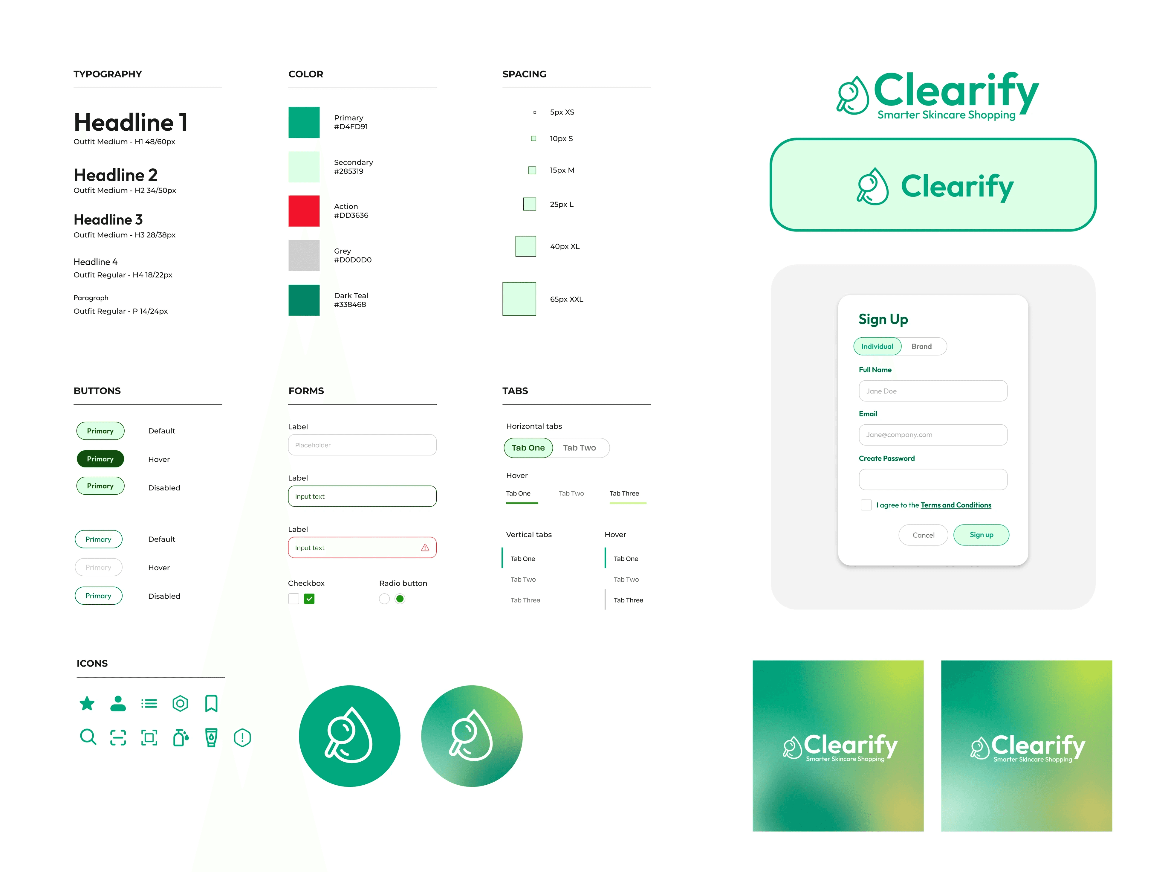
Design library — components, color palette, and typography
Brand identity and visual language
06 · Iterations
From Sketches to Structure
Mid-Fidelity Wireframes
In our mid-fidelity wireframes, we honed in on a cohesive visual design that enhances user experience. A unified input field maintained clear visual hierarchy, while actionable prompts guided users through the ingredient analysis process.

Input screen — product name and ingredient entry
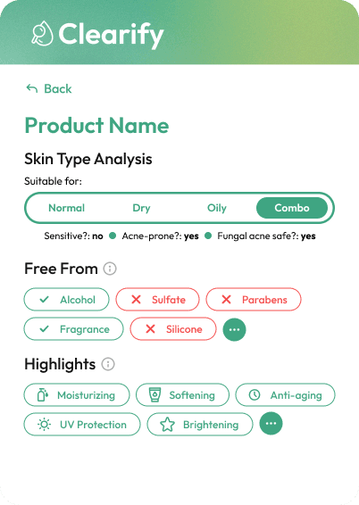
Section Indicators
At-a-glance product attributes
- Fungal Acne Free, Silicone Free, Alcohol Free labels
- Paraben Free, Sulfate Free, Fragrance Free confirmations
- Instant alignment with user skincare goals
Skin Type Analysis
Personalized compatibility
- Oily, Dry, Anti-aging, and Sensitive skin indicators
- Quick suitability assessment per skin profile
- Highlights section for Moisturizing, Anti-aging, Brightening
Usability Testing
We conducted an internal round of usability testing with our team due to time constraints, creating tasks to test navigation and gather first impressions. This provided key insights for changes within our initial user flow.
- 1Skin type suitability needed clearer delineation between suitable and unsuitable types for quick scanning
- 2The Highlights section needed to better showcase benefits without overwhelming users with too much at once
- 3Balanced information density — users needed to process important details without feeling overwhelmed
07 · Final Design
Clearify in Action
The final extension brings together all research and iteration into a polished, approachable product. Three core screens carry users from the welcome moment through ingredient input to personalized results.
Clearify extension — full interaction demo
Screen Breakdown
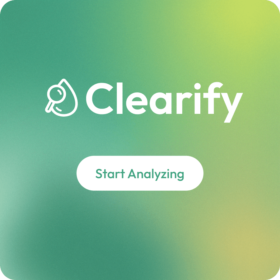
Welcome Screen
A minimalist splash with Clearify's logo and mesh gradient background — encouraging users to begin their ingredient analysis
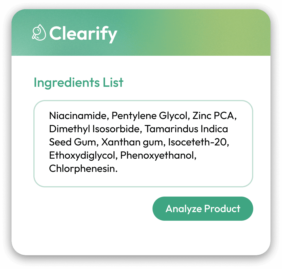
Input Screen
Clear input fields for product name and ingredient list, designed to minimize user effort and make data entry as frictionless as possible
Results Screen
Detailed skin type compatibility (Normal, Dry, Oily, Combo), a Free From section, and a Highlights section showcasing key product benefits

Output screen — design iterations and refinements
08 · Get Clearify
The Extension
Clearify is available now as a free Chrome extension. Install it from the Chrome Web Store and get instant, personalized ingredient analysis while browsing any skincare product page.
Available on the Chrome Web Store
Clearify is live and free to install — Get Clearify →
Extension — full product mockup
Extension popup — ingredient results view
09 · Reflection
Main Takeaways
Embarking on the Clearify project was a true test of agility and user-centric design. It taught me the importance of being adaptable, as user feedback often led us down new and unexpected paths. The biggest takeaway? Design with empathy, and be ready to pivot when user insights demand it.
With more time, I would delve deeper into enhancing the educational aspect of Clearify — a feature to evaluate and ensure the reliability of user-generated content would maintain platform integrity. Long-term user engagement is also a priority, with a personalized ingredient learning system that introduces users to one new ingredient each day.
Design with Empathy
User feedback reshaped our direction multiple times — staying adaptable and centered on real user needs produces better outcomes than sticking to initial assumptions
Ship Small, Iterate Fast
Building for MVP first allowed us to validate the core concept quickly and make informed decisions on where to invest more design effort
Education as a Feature
Survey data revealed a strong desire to learn — future iterations should treat ingredient education as a first-class feature, not an afterthought