

01 · Overview
Exposure to the Startup Space
As a UX Design Intern at Neoboard, a startup building tools to support educators, I focused on bringing structure and scalability to an early-stage product team. With features being designed and shipped rapidly, inefficiencies in the design process created friction between designers and engineers.
I took the lead on conducting a UX audit, establishing rapport, and building the foundations of a design system that streamlined collaboration, improved consistency, and accelerated handoff.
Component library structure and organization
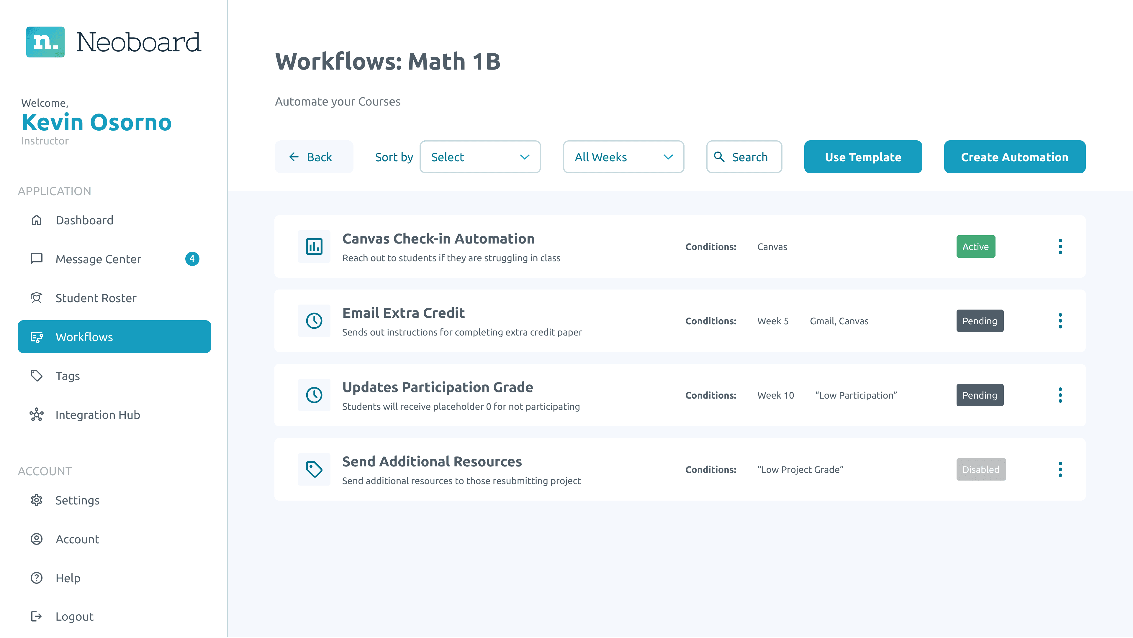
Restructured design screens with auto-layout
02 · Context
About Neoboard
What is Neoboard?
A classroom workflow web application aimed at improving student engagement and reducing teacher workload.
As part of Neoboard's 7-person design team, we faced significant challenges with high turnover — designers often join and leave each quarter. This constant flow makes maintaining design consistency difficult and requires us to onboard quickly while keeping work aligned.
In our startup environment, many designers are interns or newer to the field, creating gaps in UX maturity across the team. This leads to fragmented designs with inconsistent typefaces, unnecessary component duplication, and a lack of standardization, slowing our process and complicating developer handoffs.
Upgrading our design system was crucial to maintain consistency, onboard new designers efficiently, and enable smoother handoffs to developers — allowing us to focus on real priorities identified from previous research rather than constantly dealing with design fragmentation.
03 · The Challenge
Current Organizational State
The Problem
- 1High turnover among the design team required an upgraded design system
- 2Inconsistent design elements and a lack of standardization across the team led to challenges
- 3Gaps in both the user experience and design handoff processes
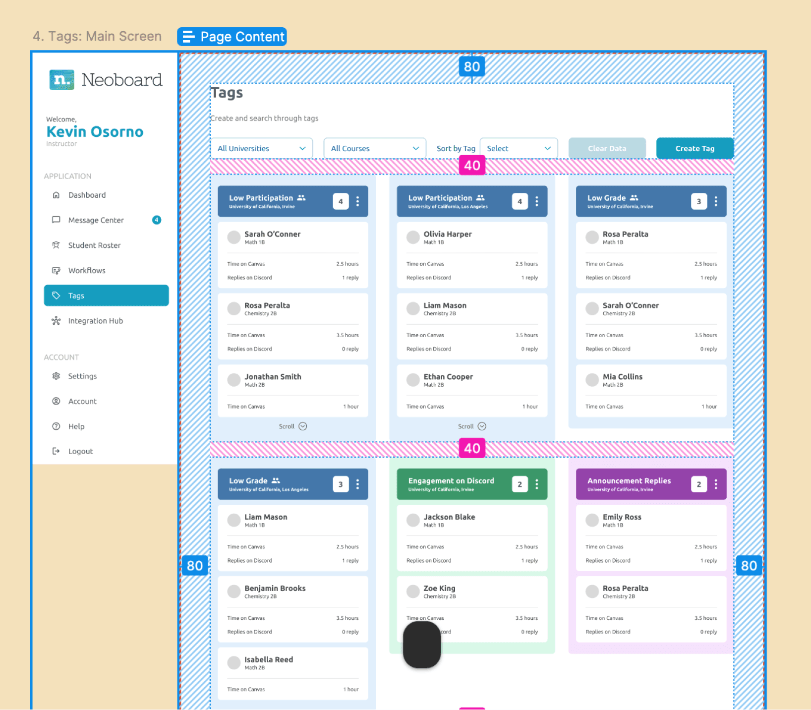
Previous design library showing inconsistencies
Startups thrive on speed, but speed creates fragmentation. At Neoboard, design files were inconsistent, components weren't standardized, and features weren't always aligned with MVP scope. This lack of structure led to repeated demos, inefficient iterations, and misalignments with engineering.
Inefficient Structures
Screens weren't built in auto-layout, making iteration and responsiveness time-consuming
Inconsistent Components
Buttons, text styles, and layouts varied across files with no shared source of truth
Collaboration Gaps
Engineers lacked a clear framework for interpreting designs, leading to back-and-forth clarifications
Thinking in the Developer's Shoes
Engineers implemented their own naming conventions and spacing — no standardized design system or structure between teams caused delays.
How Might We
How might we create a scalable design system that empowers designers to work faster, collaborate better with engineers, and maintain consistency across Neoboard's growing platform?
04 · Research
Identifying Needs
Reviewing Feedback
Our main goal initially was to get out demos to identify areas for improvement. Demos exposed inconsistent designs due to a lack of a standardized design system.
As we were collectively running demos, some educators found the platform's features useful, but noted inconsistent UI elements. Feedback emphasized the need for a cohesive design flow to simplify adoption.
"The features are useful, but the inconsistent UI elements make it harder to adopt."
— Educator Feedback
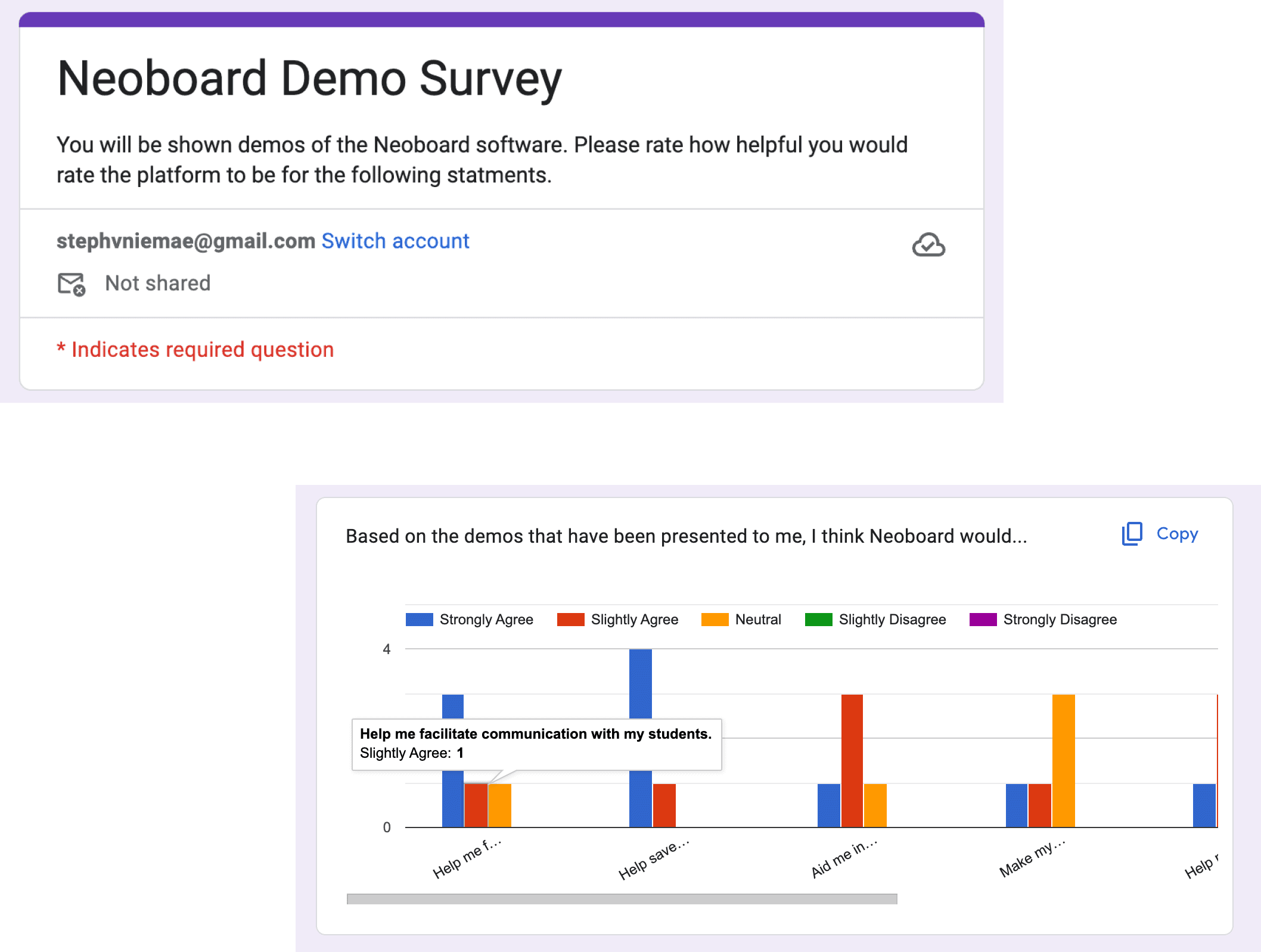
Demos and research sessions with educators
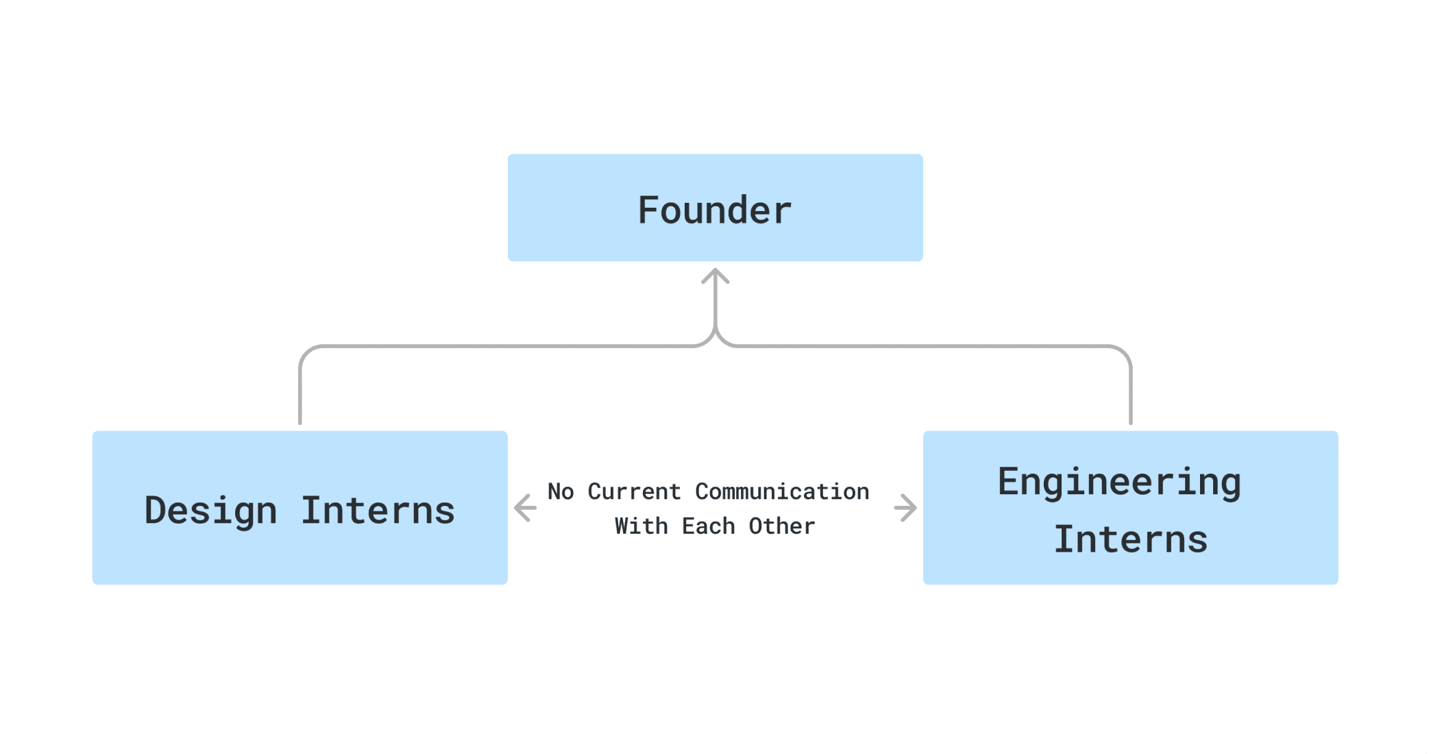
Analyzing patterns internally in the organization
Understanding the Teams
I started by researching established design libraries for inspiration, which helped me understand how successful systems were structured and provided clear direction for improving our own.
I initiated conversations with engineers to align our designs with their tech stack (React, Bootstrap, and Flexbox), ensuring components would be compatible for smoother handoff and implementation.
During weekly meetings, I asked the design team about their biggest pain points and discovered they struggled to locate components. This highlighted the need for better documentation and organization to enhance findability and workflow efficiency. Based on these insights, I prioritized two key areas for impact:
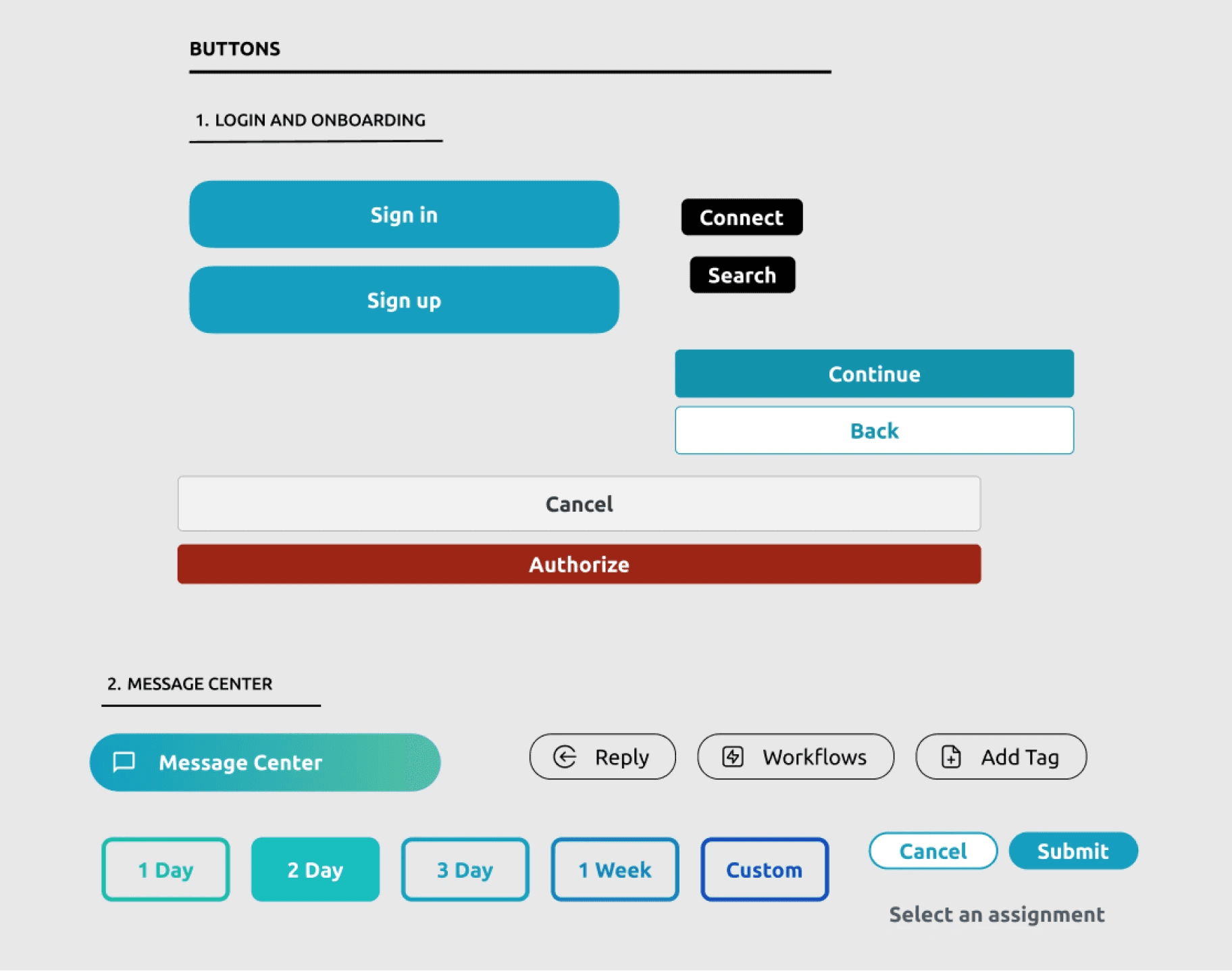
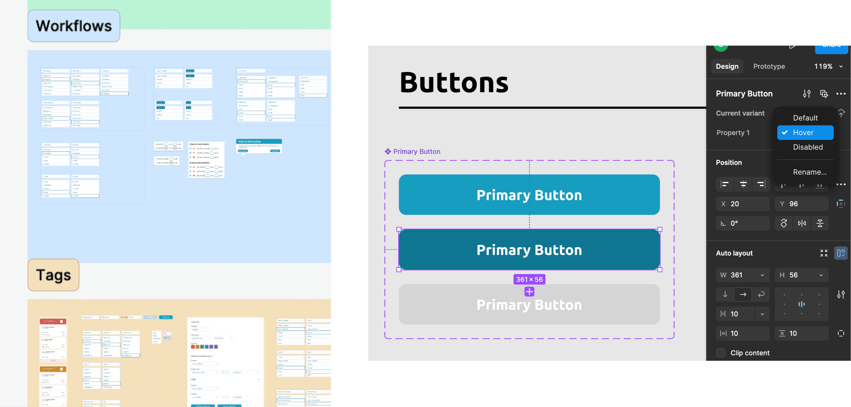
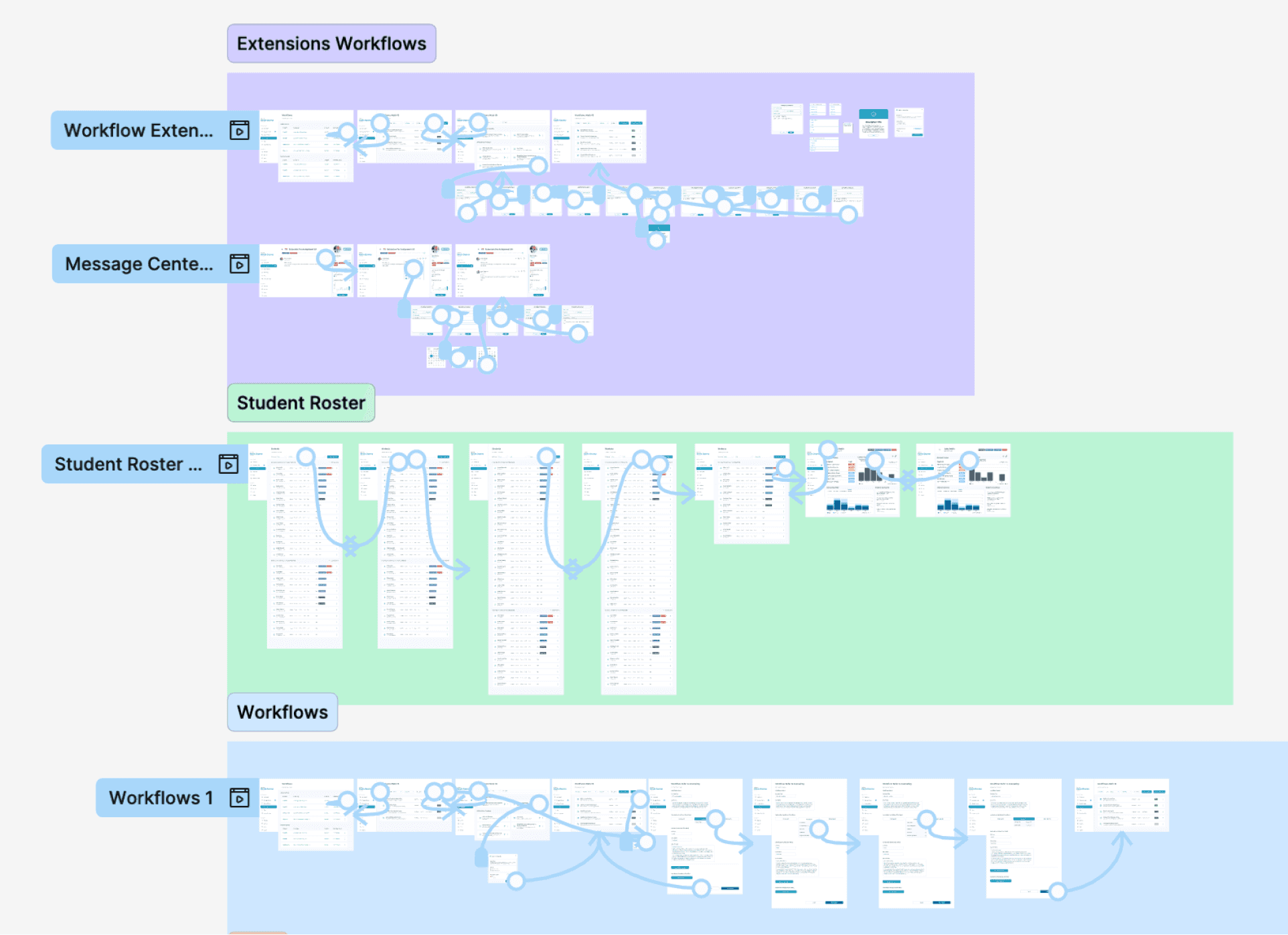
Auto-Layout & Component Library
Structured reusable components and auto-layout
- Restructured design screens into auto-layout for flexible, responsive design
- Built a component library of buttons, form fields, and navigation elements organized by category
- Paired with another intern to run knowledge-sharing sessions
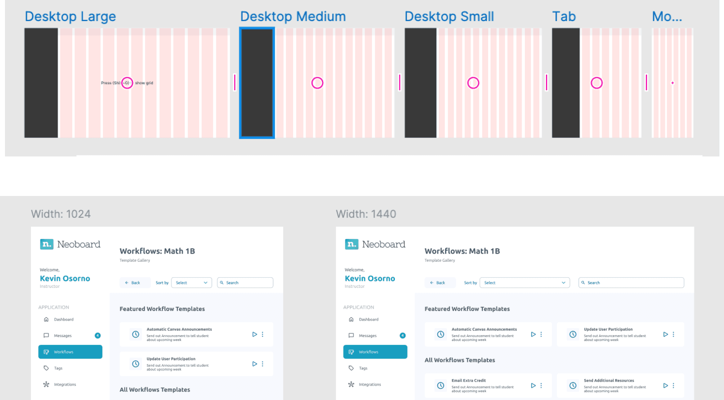
12-Column Grid System
Based on React Bootstrap for design-dev consistency
- Introduced a grid system to ensure consistency between design and development
- Outlined grid usage rules and documented them for engineers
- Bridged the gap between Figma and code implementation
05 · Design System
Establishing the Design System
Conducting a UX Audit
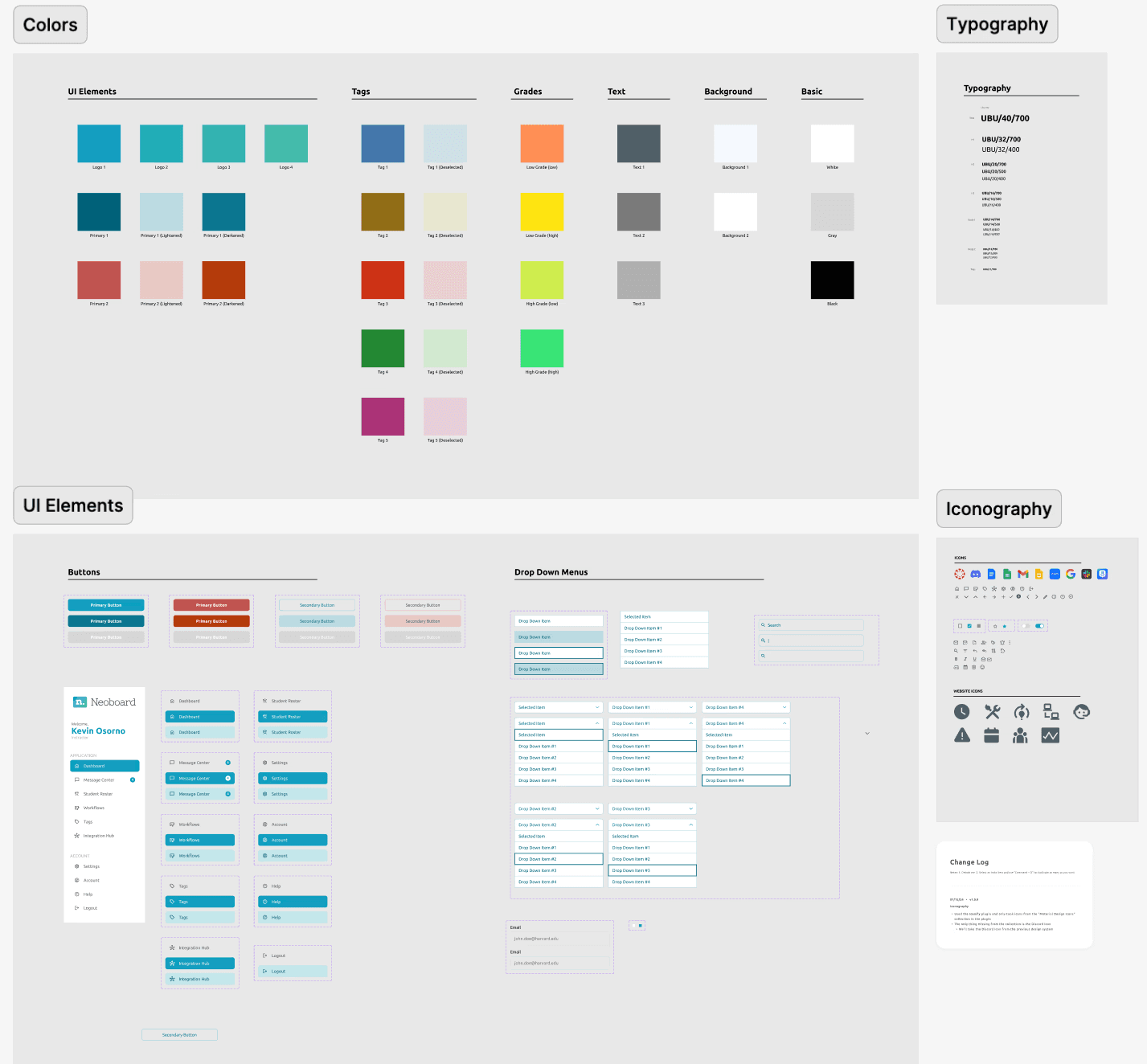
Our first step was conducting a comprehensive UX audit of existing designs, taking stock of all components to identify which were used consistently and which were redundant or unused. A key part of this process was standardizing typeface and color styles, assigning font sizes and weights logically using HTML-style headings (H1, H2, H3, H4) to create consistency and make it easier for engineers to implement designs accurately.
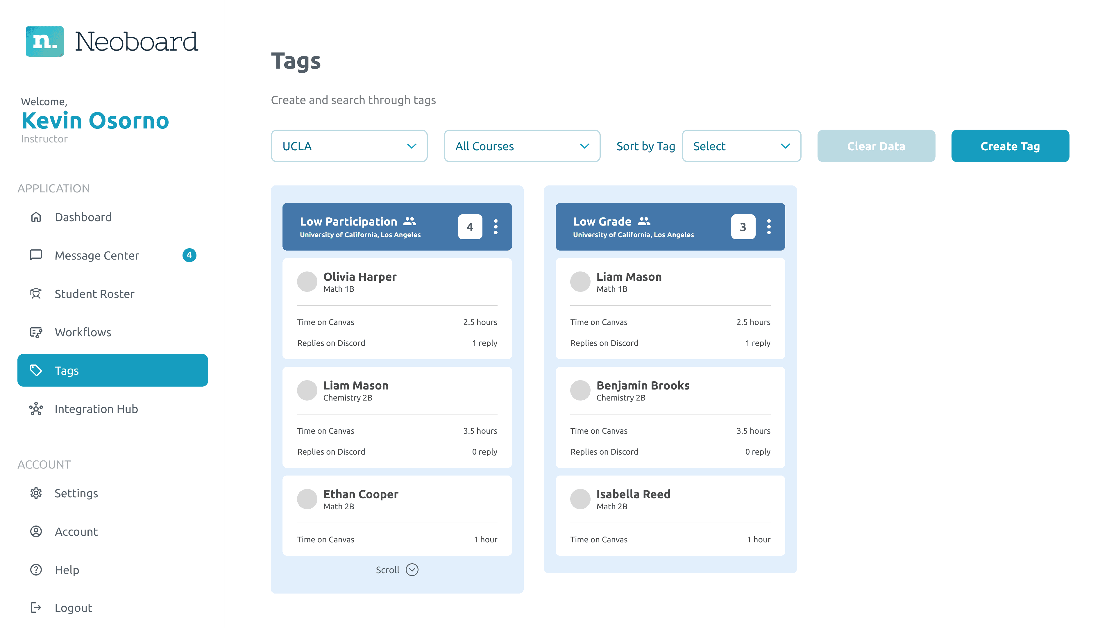
Cleaning Up Components
Next, we cleaned up components to ensure consistency across all platform pages, consolidating similar components and removing unnecessary duplicates. A major issue we discovered was that many components were only used on one page, creating inconsistency across the app. We streamlined the design process and made it easier to maintain a cohesive look and feel by eliminating these one-off components.
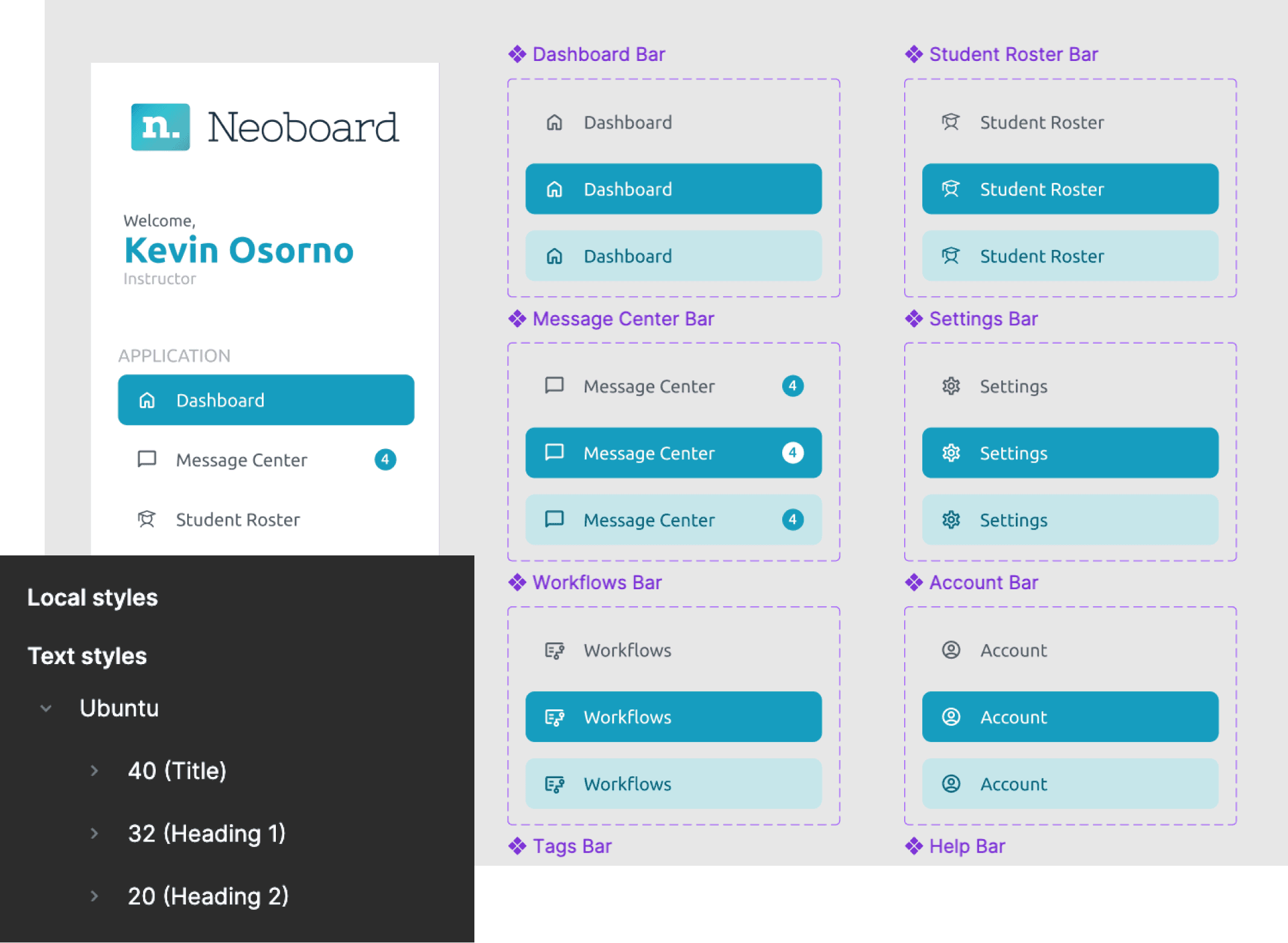
Ensuring components are consistent across pages and styles are standardized
06 · Improvements
Empowering Change Through Communication and Standardization
Cross-Team Collaboration
- 1Held training sessions to teach Figma features such as auto layout and components
- 2Brought the design team up to speed on the design library to ensure everyone was aligned
- 3Opened dialogue with engineers to ensure the design handoff process was clear and efficient
Preparing for Usability Testing
Reflecting on demo feedback, the design team prepared for usability testing by planning to apply the finalized design library. The goal was to evaluate how well the new system improved efficiency, consistency, and overall usability for the team.
Even though my internship ended before we could fully complete the usability testing, we had already laid the groundwork for a smoother process moving forward.
Assessing the effectiveness of the design library
Organizing components and adding properties for easy reuse
07 · Retrospective
Retrospective
Contributions and Wins
We established a standardized design library and improved collaboration between the design and development teams. This created a more cohesive path for the team to continue refining the product.
100%
Adoption rate by designers and engineers
Faster
Iteration speed for designers using reusable components
Clearer
Communication between design and engineering teams
Design system outcomes and team adoption
Moving Forward
This work established the groundwork for Neoboard's design system — a foundation that can evolve as the product scales. Looking ahead, Neoboard can expand this system into a full design library, align it with accessibility best practices, and extend it into brand-level guidelines.
Being Vocal
Importance of vocalizing concerns to leadership when spotting inefficiencies early in the process
Cross-Functional Collaboration
Building trust between design and engineering through structured processes and shared language
What I've Personally Taken Away
- 1Learned to balance the need for speed with the importance of long-term systems thinking
- 2Discovered the impact of stepping back to fix foundational issues rather than only focusing on features
- 3Strengthened skills in communicating design intent to engineers and building shared language across disciplines