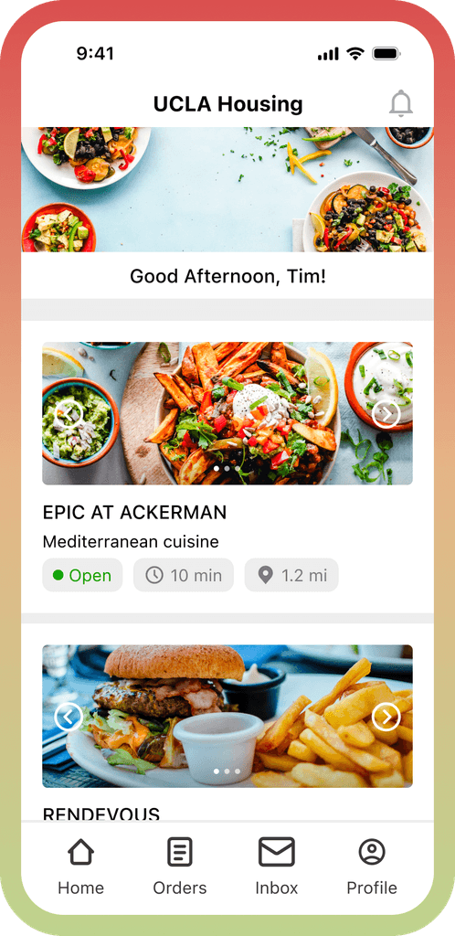
The Transact Mobile Ordering App, originally plagued with navigation and usability issues, was redesigned to provide a more intuitive and efficient user experience for campus dining.
The redesign aimed to address the key challenges of unclear order details, cumbersome navigation, and a lack of customization options.
My team and I chose this project for my PSYCH 124B: Fundamentals of User Experience course, as it directly related to my studies and daily life as a UCLA student. The project focused on improving the Transact Mobile Ordering App, a platform my team and I frequently used, providing us with a perfect opportunity to apply our academic knowledge and make a tangible impact on our campus community.
Shoutout to my team: Diana Tran, Trisha Patel, Angela Fan, Ayesha Alvi, Yanjun Jin
The project's primary challenge was enhancing the mobile food ordering process for UCLA students. We faced a tight timeline and the need to balance user needs with the app’s technical constraints. The project was unique in its focus on the specific needs of the campus community, requiring tailored solutions.
How can we clarify order details and customization options to create a more user-friendly experience for university students?
The app's users, primarily university students, struggled with its cumbersome navigation and were often confused about order details and customization options. The project's goal was to simplify these elements to create a more user-friendly mobile ordering experience.
Research
We employed a semi-structured interview format, allowing us to gain insights into the users' experiences with the app. This approach facilitated a deeper understanding of their struggles and preferences, helping us identify key areas for improvement. The two-stage interview process included direct interaction with the app followed by discussions about their experiences. Here were the questions we asked:
What specific features of the user interface contribute to an efficient and enjoyable ordering process?
What features and design elements contribute to a positive experience when users explore menus in a food ordering app?
How important are customization options for users, and what specific customizations do they value the most?
What features of real-time order tracking are most valued by users?
Research
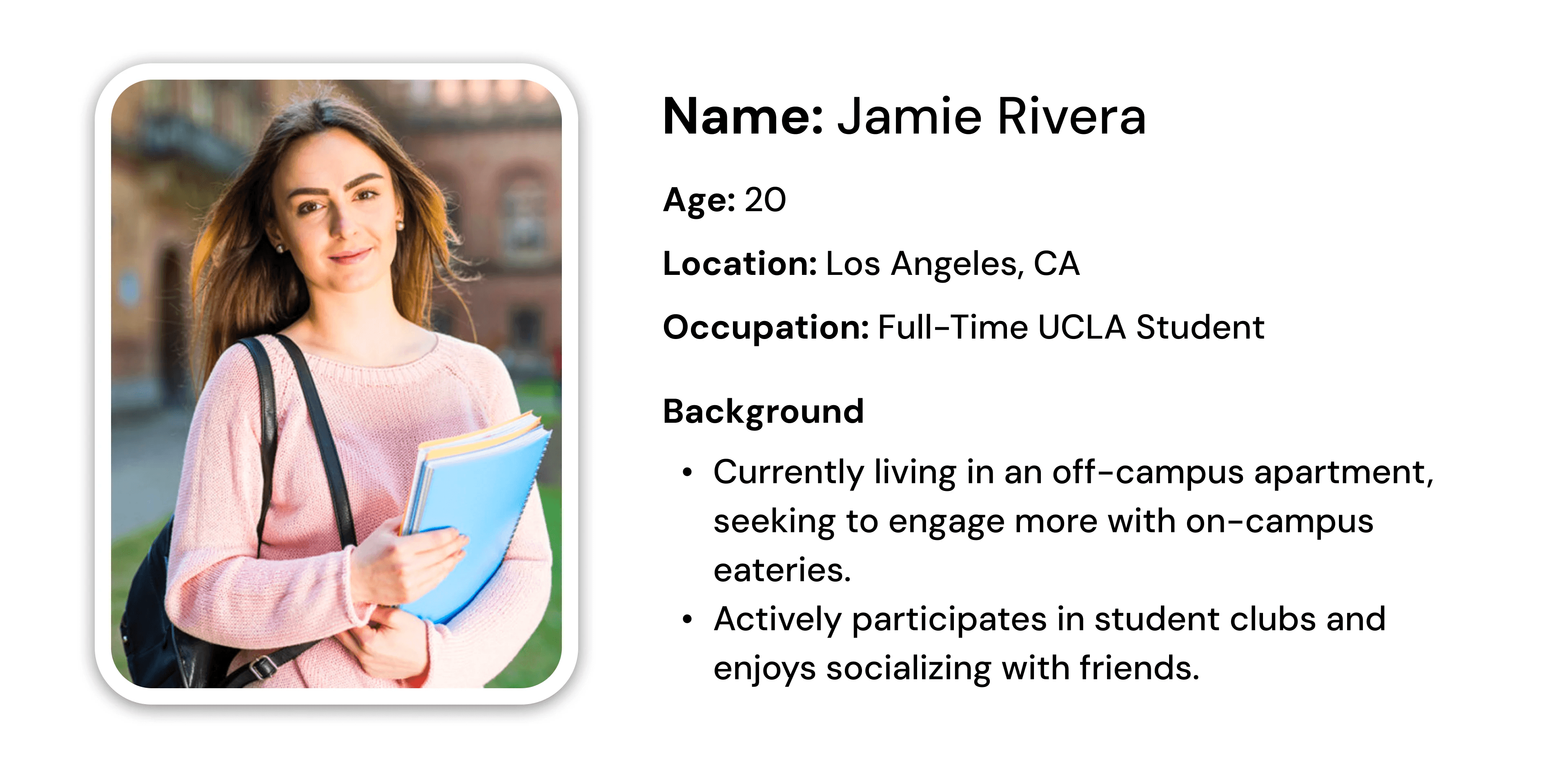
Our updated persona now has a more nuanced lifestyle and preferences, with a stronger emphasis on customization and quick payment options that reflect the need for a more personalized and efficient lifestyle, valuing the reordering favorites function and real-time order updates.
Goals and Motivations
Aims to effectively manage time between academic and social activities.
Seeks convenience in daily tasks, with a strong preference for customization and quick payment options.
Looks for efficient ways to eat healthily and explore cuisines without spending too much time on meal prep.
Frustrations
Difficulty in navigating back to the home screen after placing an order, which affects the experience of exploring other menu options.
Experiences frustration with the limited ability to easily reorder or delete items during the checkout process.
App Usage
Uses the app to order meals between classes, often customizing orders based on dietary preferences and exploring new menu items.
Pays close attention to the app’s feedback on order status and wishes for a more interactive and informative experience.
Research
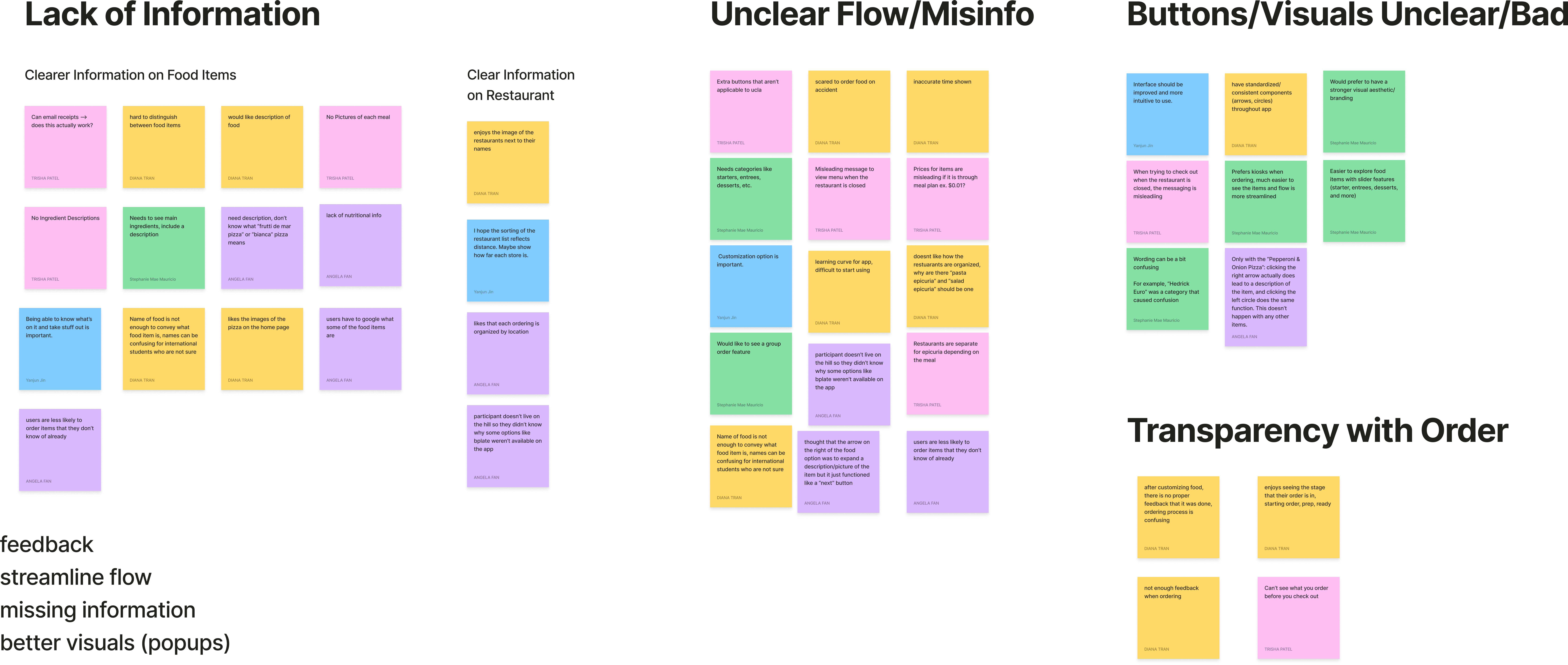
After conducting user interviews, we used affinity diagrams to organize feedback into coherent themes, which facilitated pattern recognition and highlighted key areas for improvement, such as navigation clarity and informational feedback.
Lack of Information
Users found it difficult to distinguish between food items due to unclear naming conventions and a lack of descriptive information.
Unclear Flow/Misinformation:
Users reported a fear of ordering the wrong item by accident due to unclear flow and misleading messages.
Buttons/Visuals:
The interface was criticized for not being intuitive, with users noting that standardized visual components were missing.
Transparency with Order:
After customizing their order, users lacked proper feedback indicating that the customization was processed, leading to confusion.
The redesign aimed to simplify the ordering process, making it more intuitive and user-friendly, ultimately enhancing user satisfaction.
Ideation
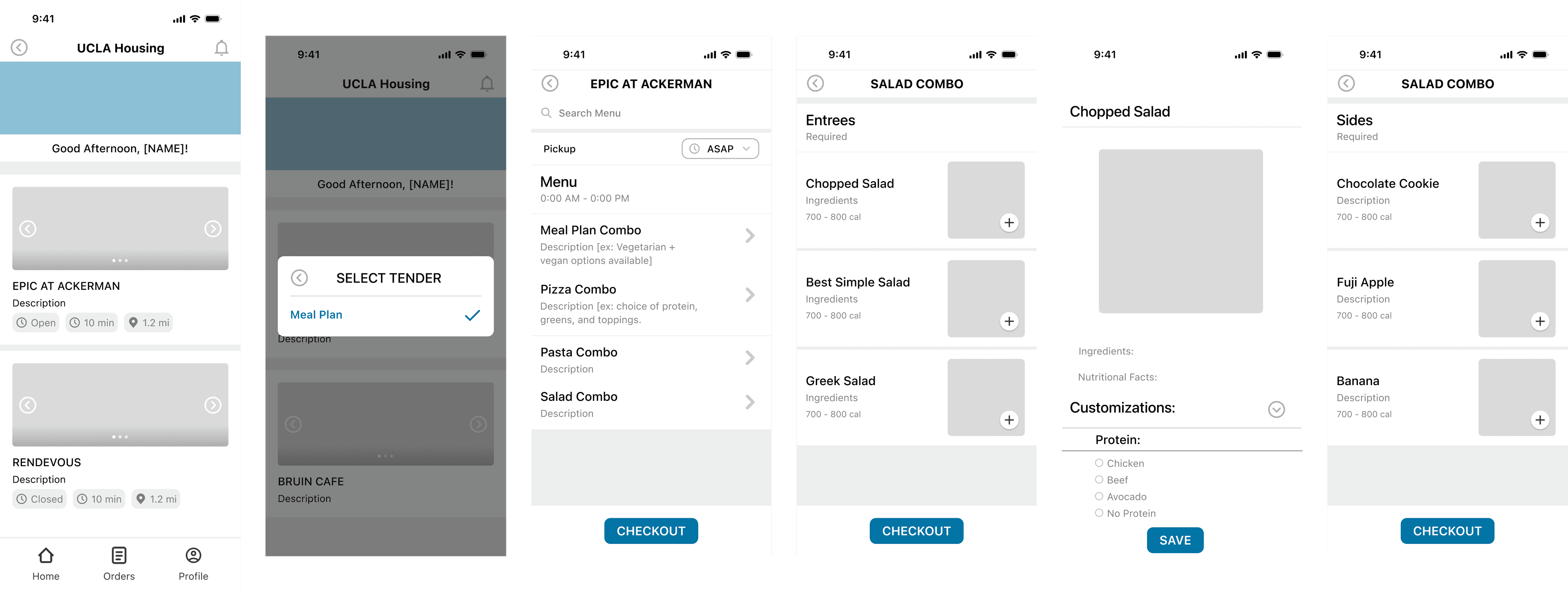
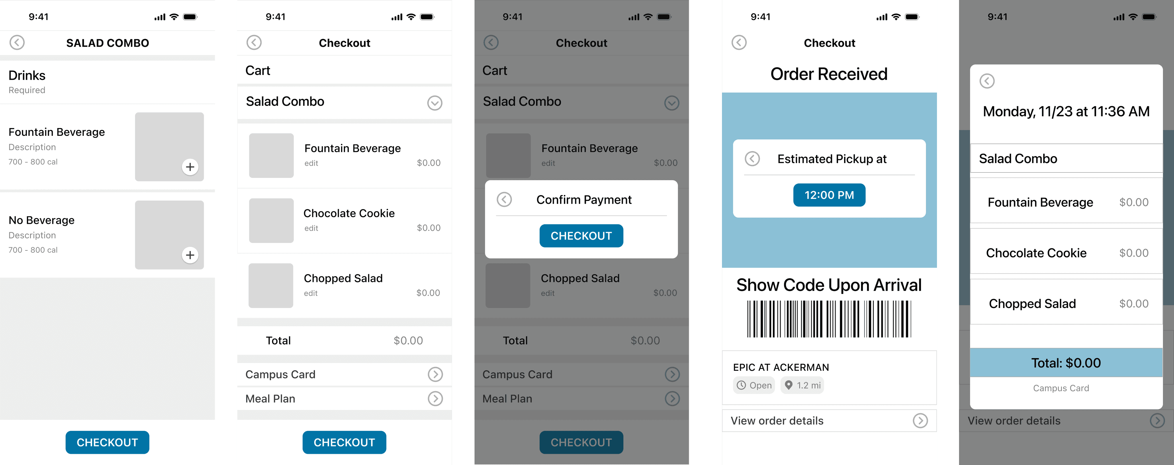
We aimed to establish a basic visual structure for the app's interface, focusing on functionality over aesthetics due to the time constraints.
The wireframes featured essential elements like home, orders, and profile tabs; restaurant selections with estimated wait times; meal combos with customizable options; and a checkout process that included order review and confirmation stages.
User testing on these wireframes highlighted areas for further refinement, particularly in improving visual clarity and streamlining the user journey from selection to checkout.
Prototyping
Participants were observed in person as they integrated with the lo-fi prototype.
Sessions begin with a background explanation as to the functionality of the mobile ordering app, as well as a series of questions to evaluate the participant’s familiarity with on-campus dining and ordering options.
The participants were then sent a link to the interactive prototype and a list of the 10 heuristics for evaluation. They were asked to complete a series of tasks and verbally walk the interviewer through their thought process.
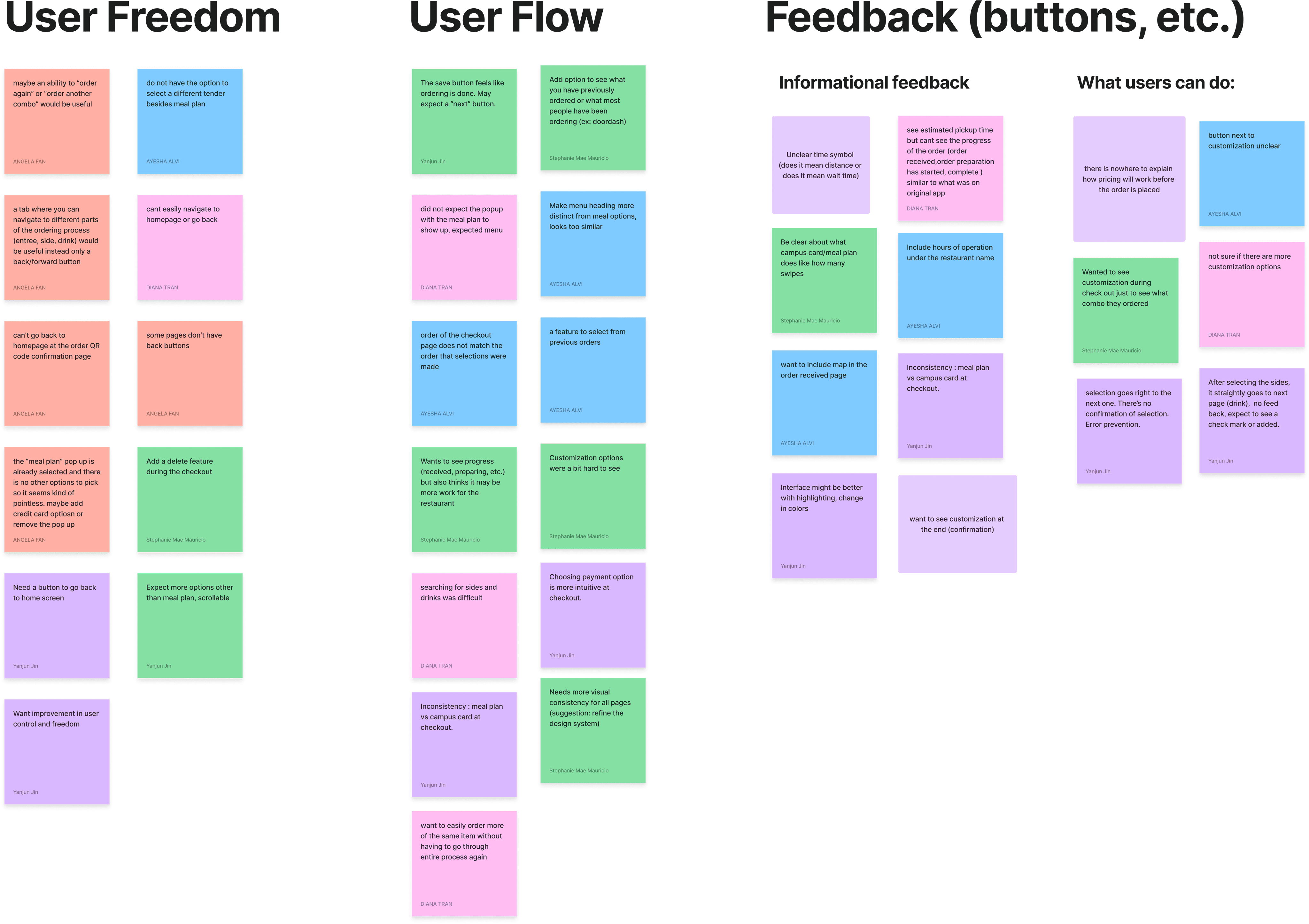
Feedback on visual elements indicated a need for consistency in design and more informative cues, such as wait times and order progress. These insights aim to enhance the user experience by addressing these specific usability challenges.
This exercise aimed to uncover patterns in user experience, particularly regarding the usability principles or "heuristics" outlined by Jakob Nielsen.
It involved organizing user comments into themes such as User Freedom, User Flow, and Feedback, each corresponding to specific heuristics like user control and freedom, consistency and standards, or error prevention.
Prototyping
These findings indicate that we can improve our future prototype with:
Better user freedom by using tabs for each order stage to help with navigation and editing.
Better feedback by demonstrating clear wait times both when selecting the restaurant and after receiving the order, and showing customizations and a map feature on the confirmation page too.
Better user flow by increasing efficiency and enabling adding previous ordered item or favorites to cart directly, implemented as an option at the beginning of the order and a button option for each type of food selection.
Final Design
Transact
The redesign was successful, leading to a more user-friendly interface that simplified the ordering process. Key improvements included streamlined navigation, clearer customization options, and the provision of real-time order updates. The redesigned app received positive feedback from users, indicating a significant improvement in user satisfaction.
Reflecting on this project, I learned the importance of an iterative design process and the value of incorporating direct user feedback. This approach was instrumental in creating a product that not only met but exceeded user expectations.
Reflection
Although the redesign of the Transact Mobile Ordering App remained a class project and was not implemented for actual use by UCLA students, it met the educational goals set forth at the beginning. Success was gauged through simulated user testing and heuristic evaluations, which indicated a clear improvement in usability and user satisfaction within the project's scope. The project provided a comprehensive learning experience, showcasing the potential impact of user-centered design on real-world applications.
Just as a home is never built in a single attempt and requires careful planning, consistent effort, and the willingness to adapt and refine, so too does a design project evolve through continuous iteration. Each iteration of the Transact Mobile Ordering App brought us closer to creating a digital 'home' for UCLA students—a familiar, welcoming space where they could effortlessly navigate and fulfill their dining needs. Throughout the project, we looped through cycles of design, ensuring that every element serves its purpose and contributes to the overall harmony of the environment. This process not only improved the app's functionality and aesthetics but also solidified my belief in the power of design to create spaces that are tailored to the needs and comforts of users.